Brand Identity Albion & East, a London-based hospitality group, were looking to expand their growing portfolio with a new bar and restaurant, this time setting their sights on the village-esque neighbourhood of Crouch End in North London. They required an identity that honoured the area’s rich heritage while introducing a fresh offering of pizza and cocktails to the community.
-
Our process began with an exploration of the area’s past, leading to a concept inspired by Crouch End’s marketplace history during the late Victorian period – a time that sparked significant growth and shaped the character of the town.
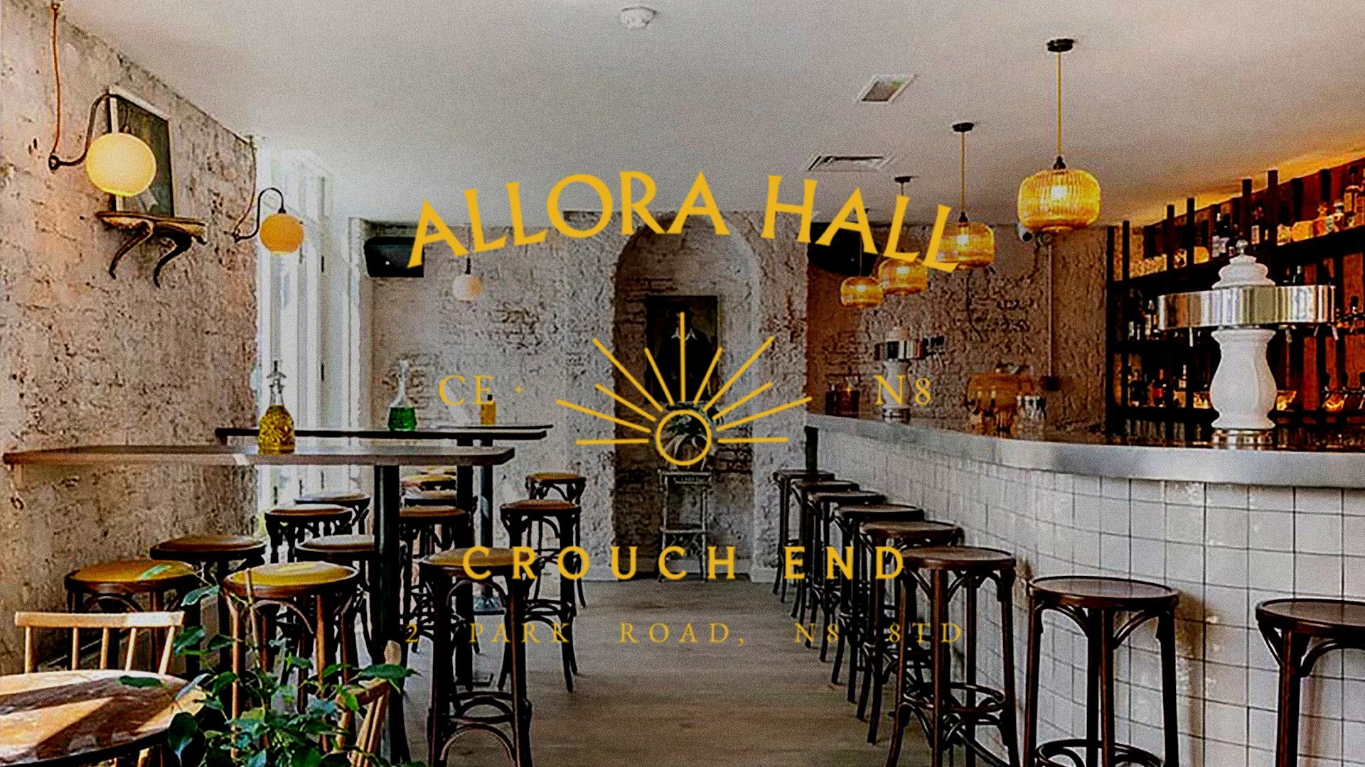
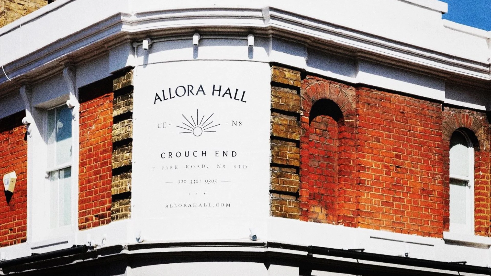
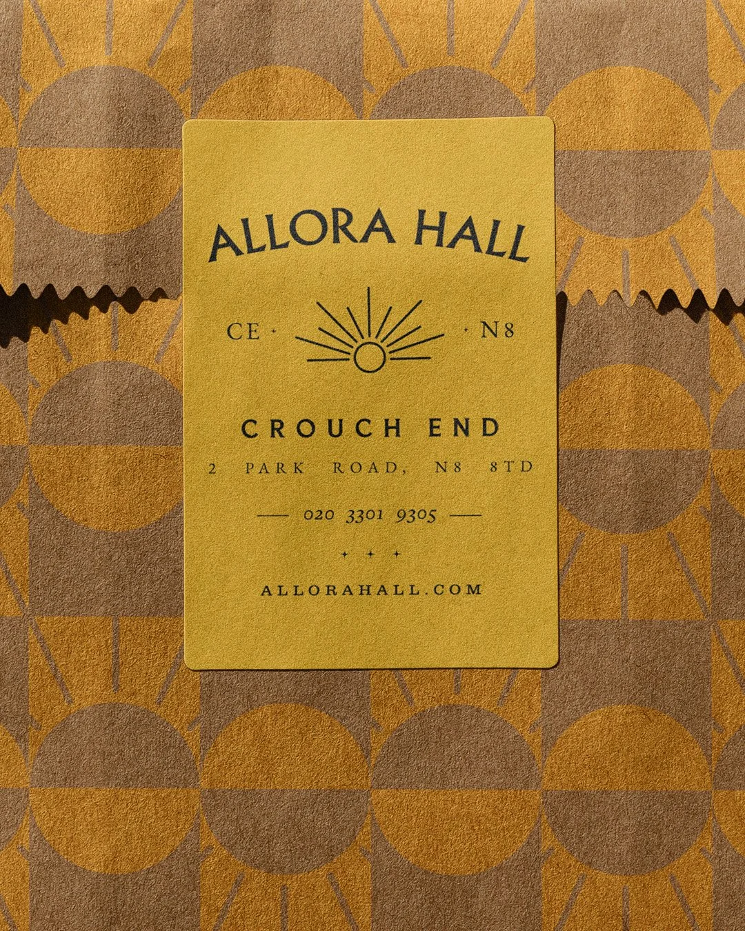
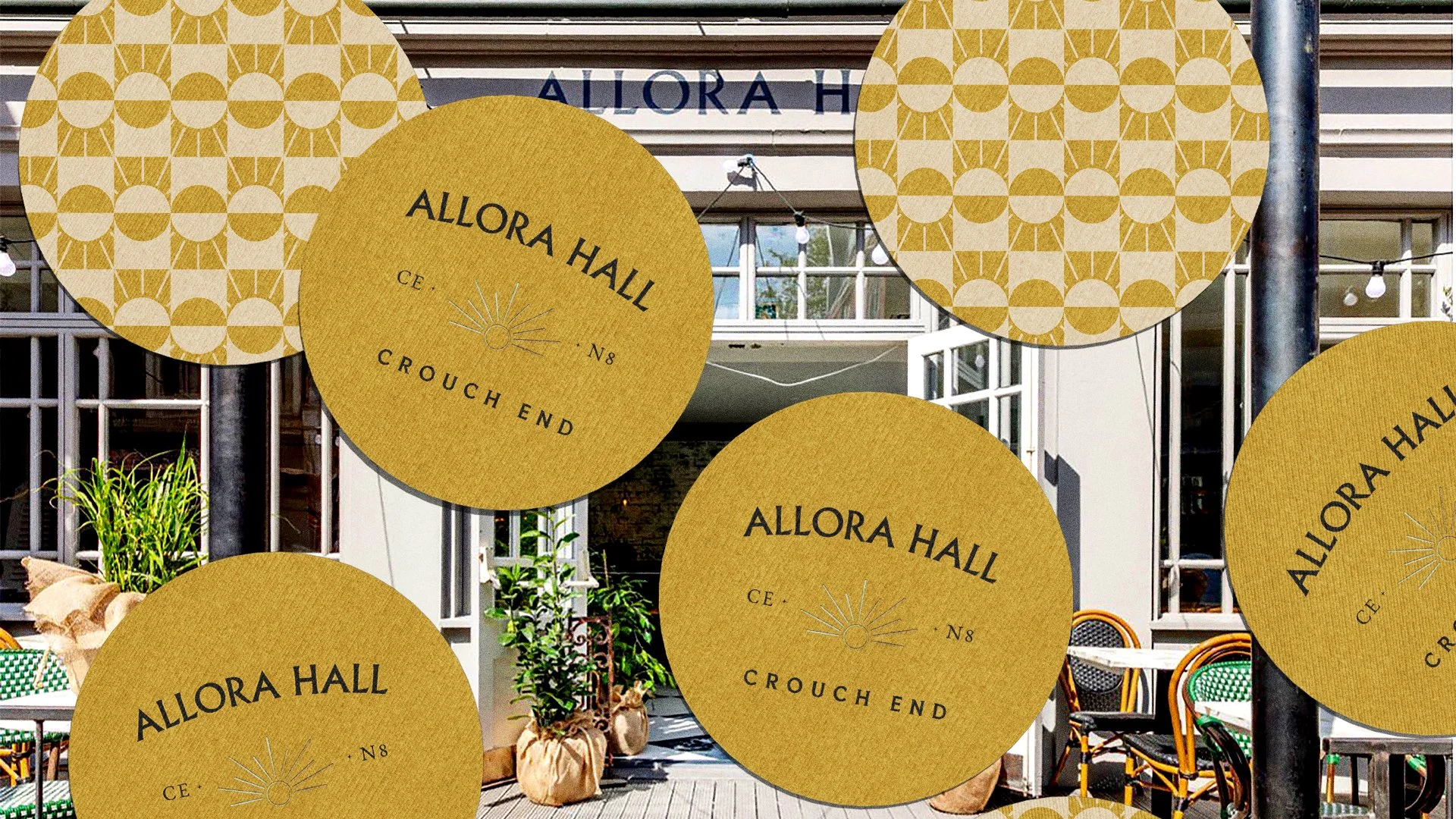
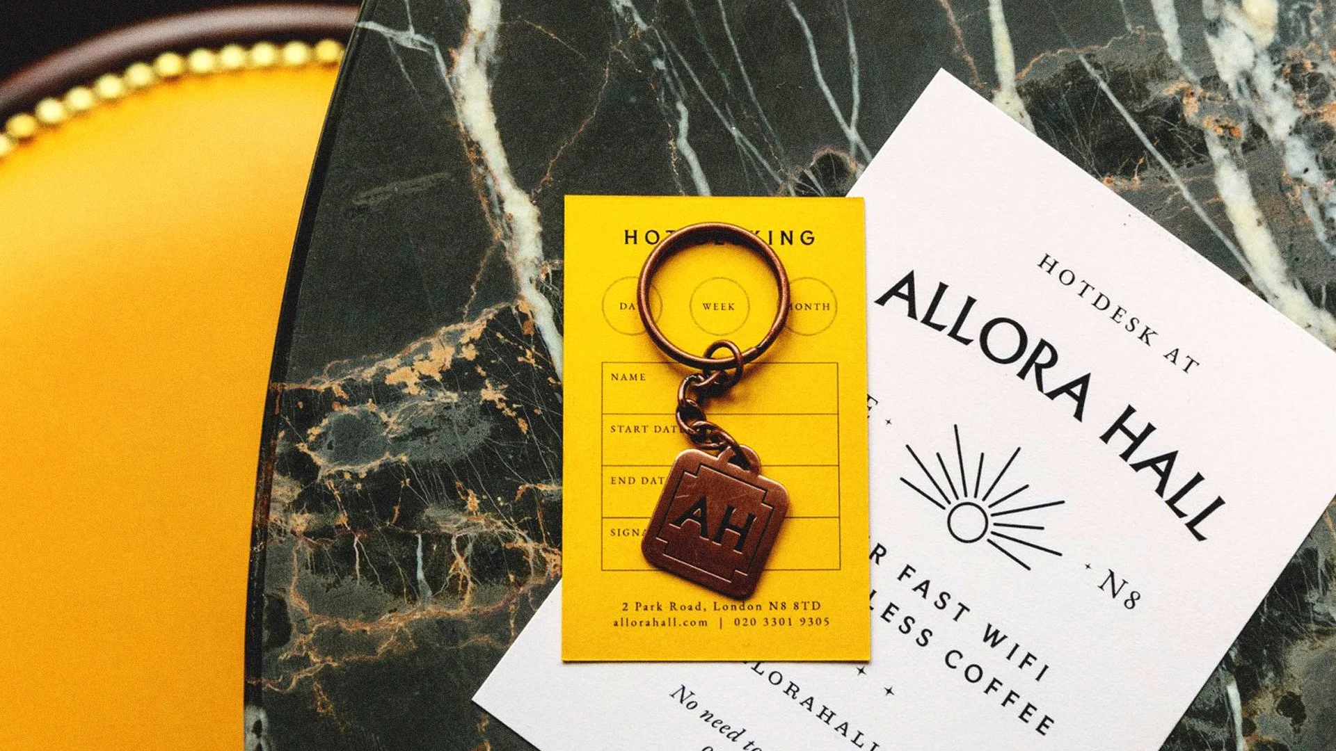
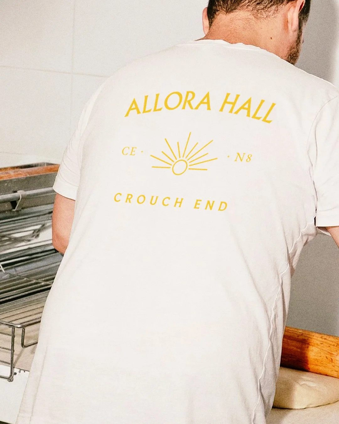
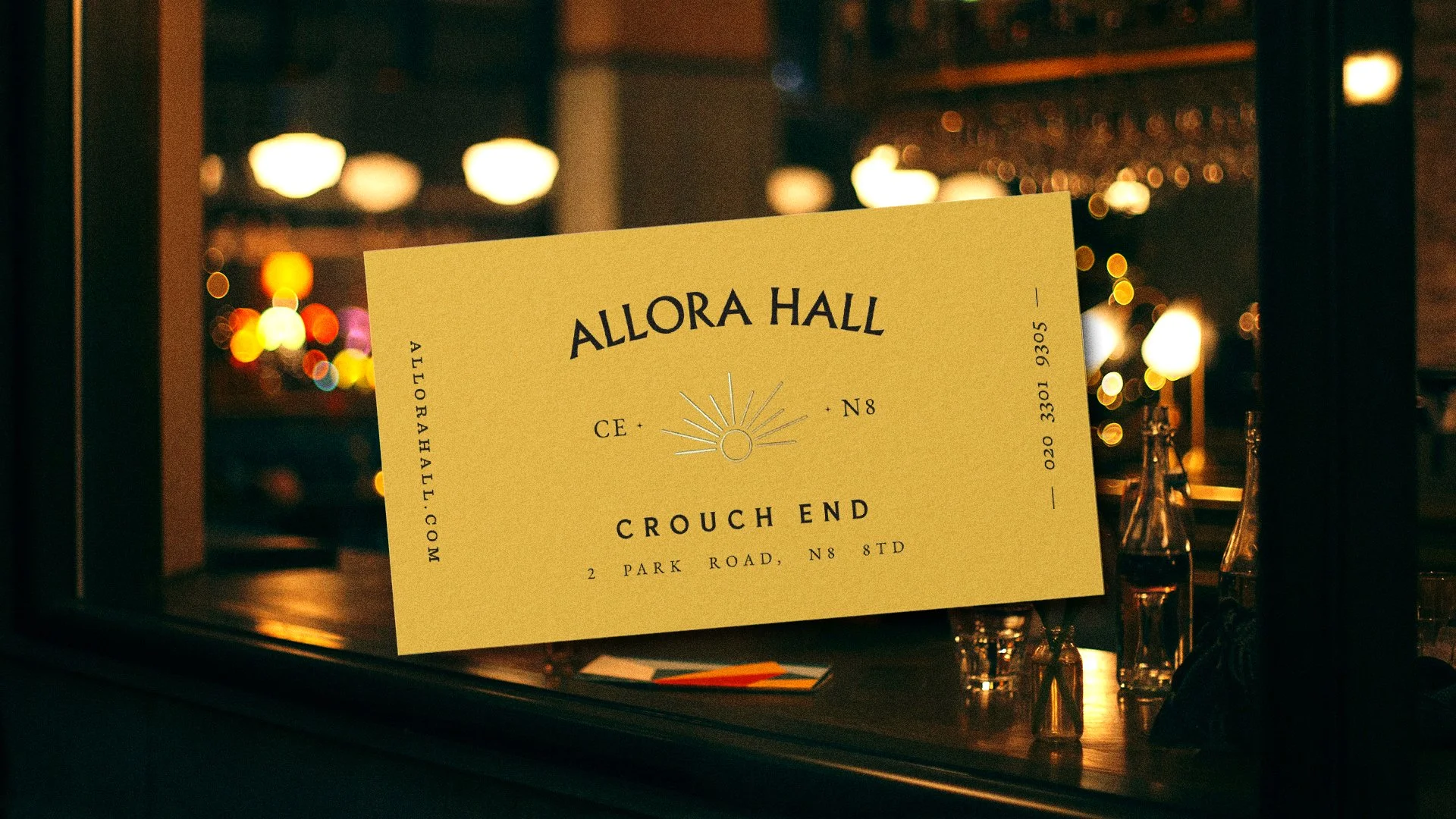
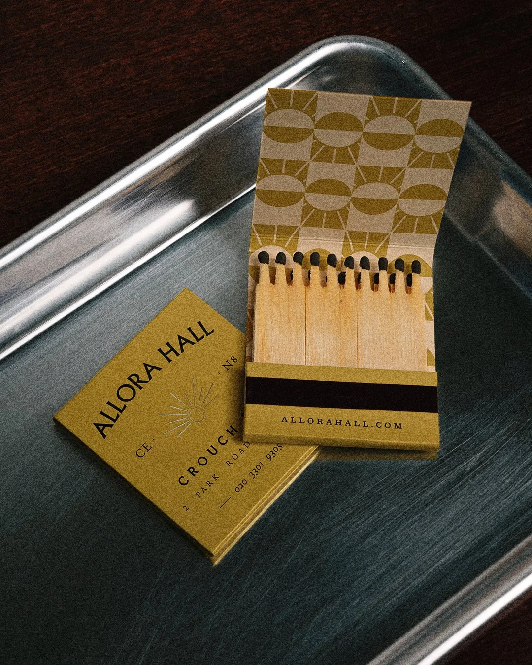
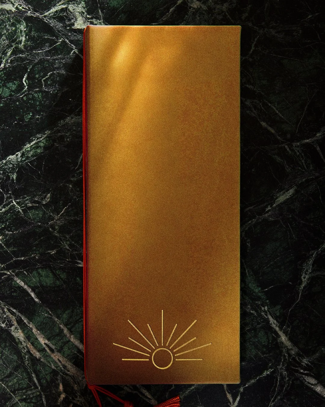
The typographic identity draws directly from this era. An etched-style logo references the engraved detailing found on buildings of the time, sitting proudly at the top of a stacked typographic arrangement inspired by late Victorian signage. At the heart of the lock-up, we developed a distinctive sun motif to act as a shorthand brand mark for the bar and restaurant. The rising sun symbolises both the start of the day and a glowing beacon at the centre of the town by night – reflecting the venue’s day-to-night offer, from breakfast and hot-desking through to evening cocktails.
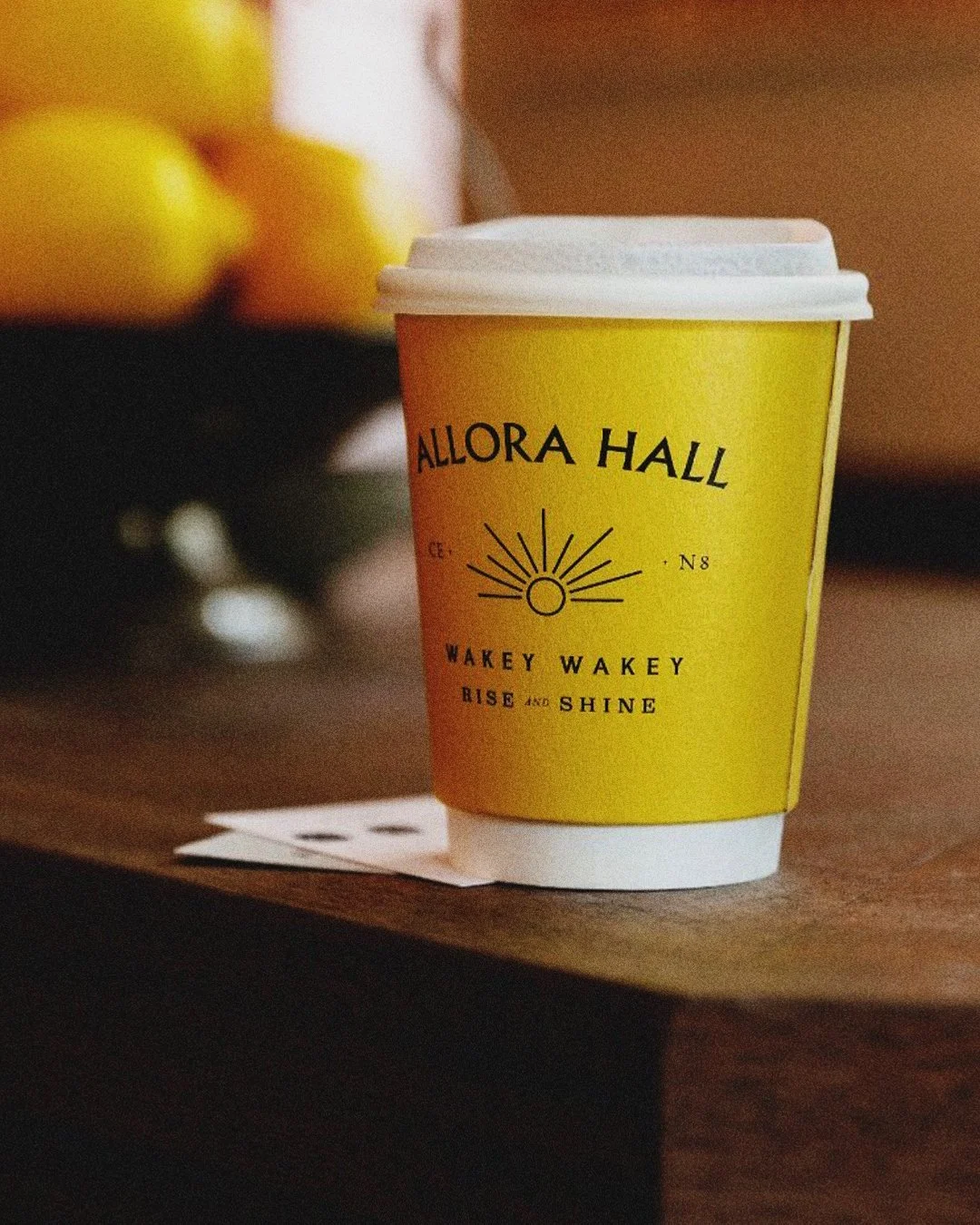
From day…

To night.
AndSmith (2021)