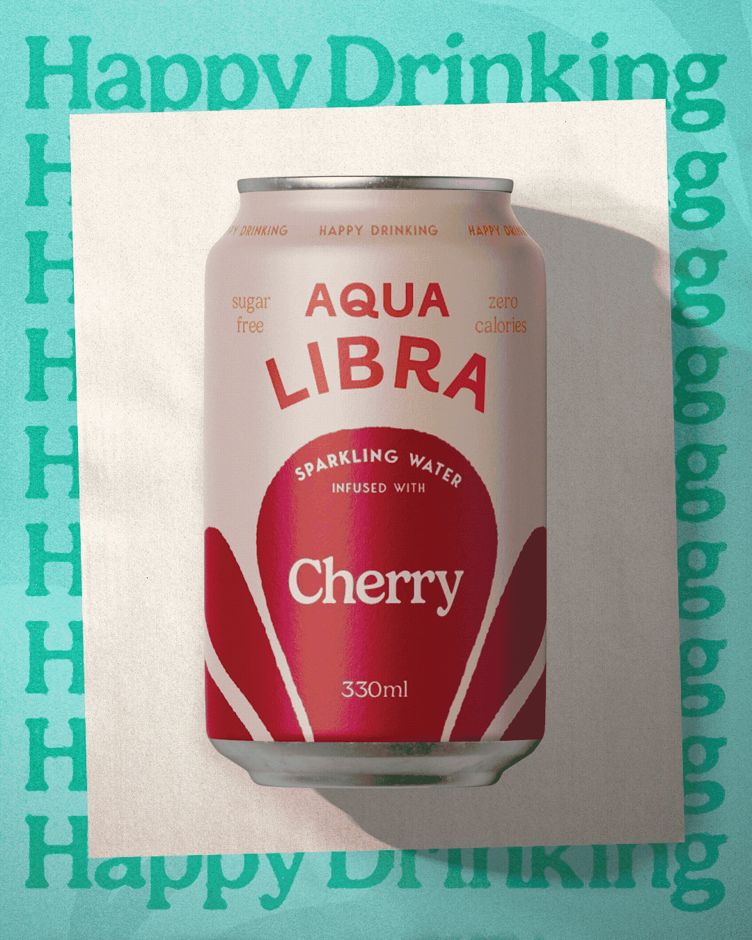
Packaging Design (Pitch)The team at Aqua Libra approached us to help evolve their brand and packaging so it could stand out in the ever-growing flavoured water category. Our response was a new brand positioning: ‘Happy Drinking’ — a celebration of water, without the boring.
-
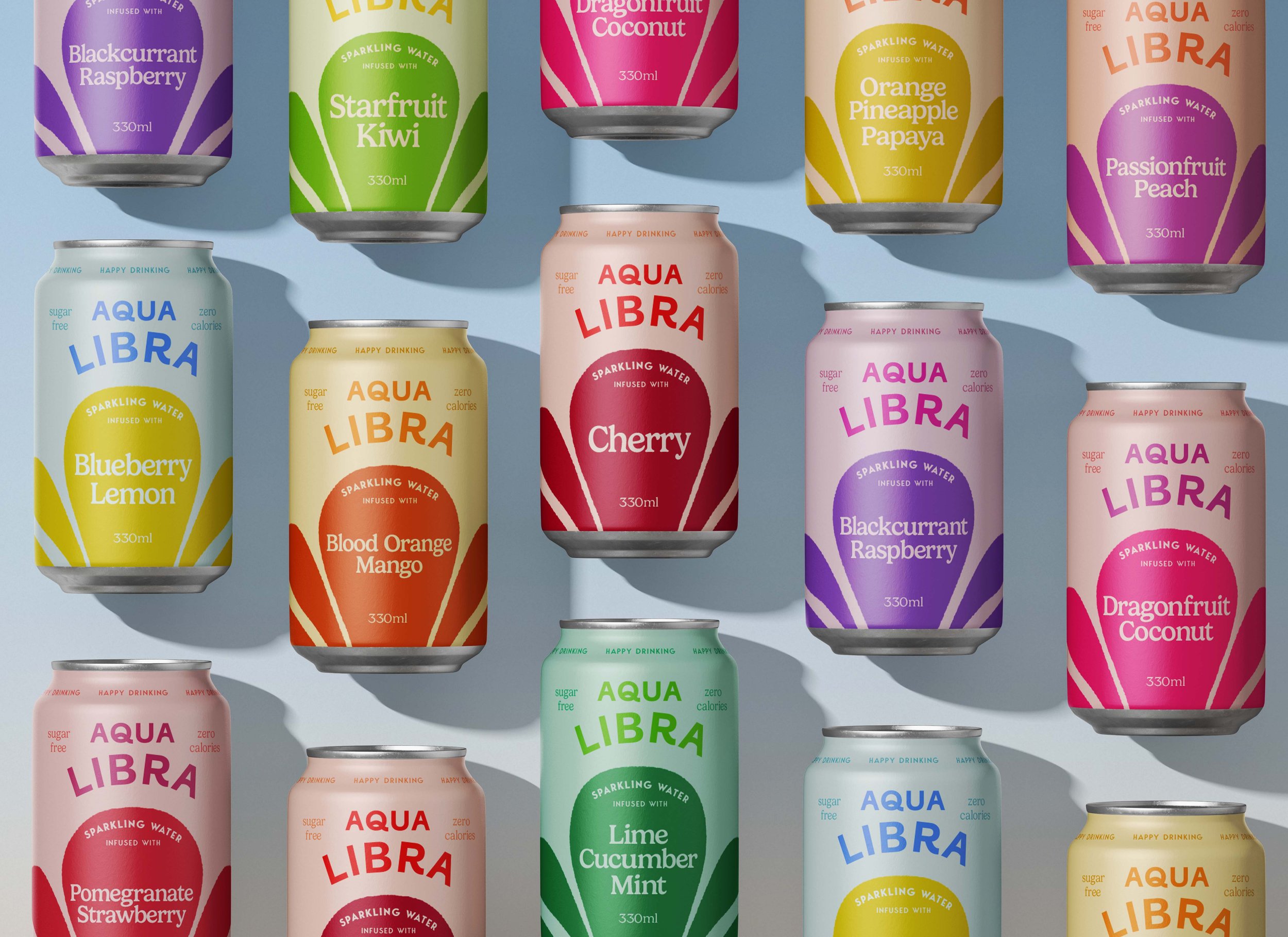
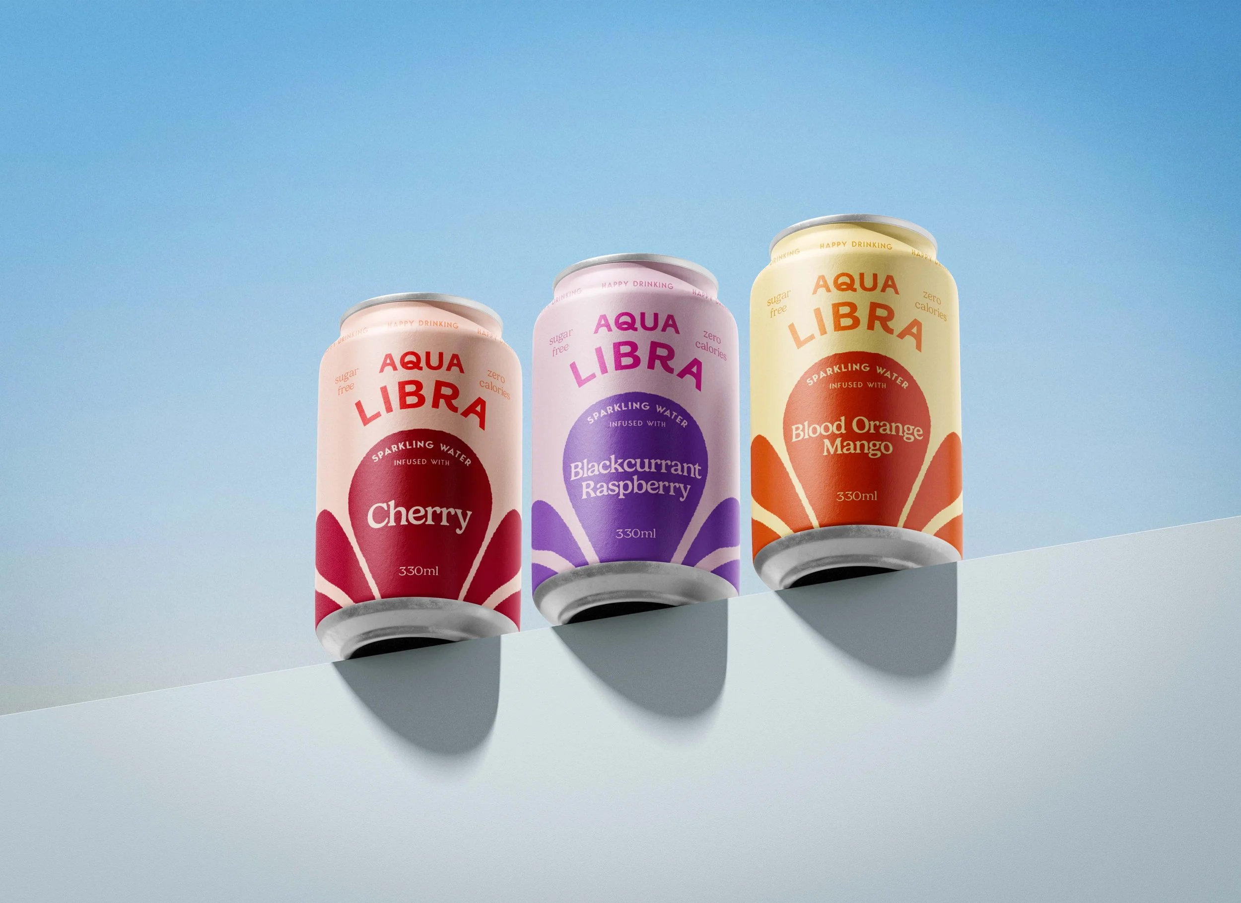
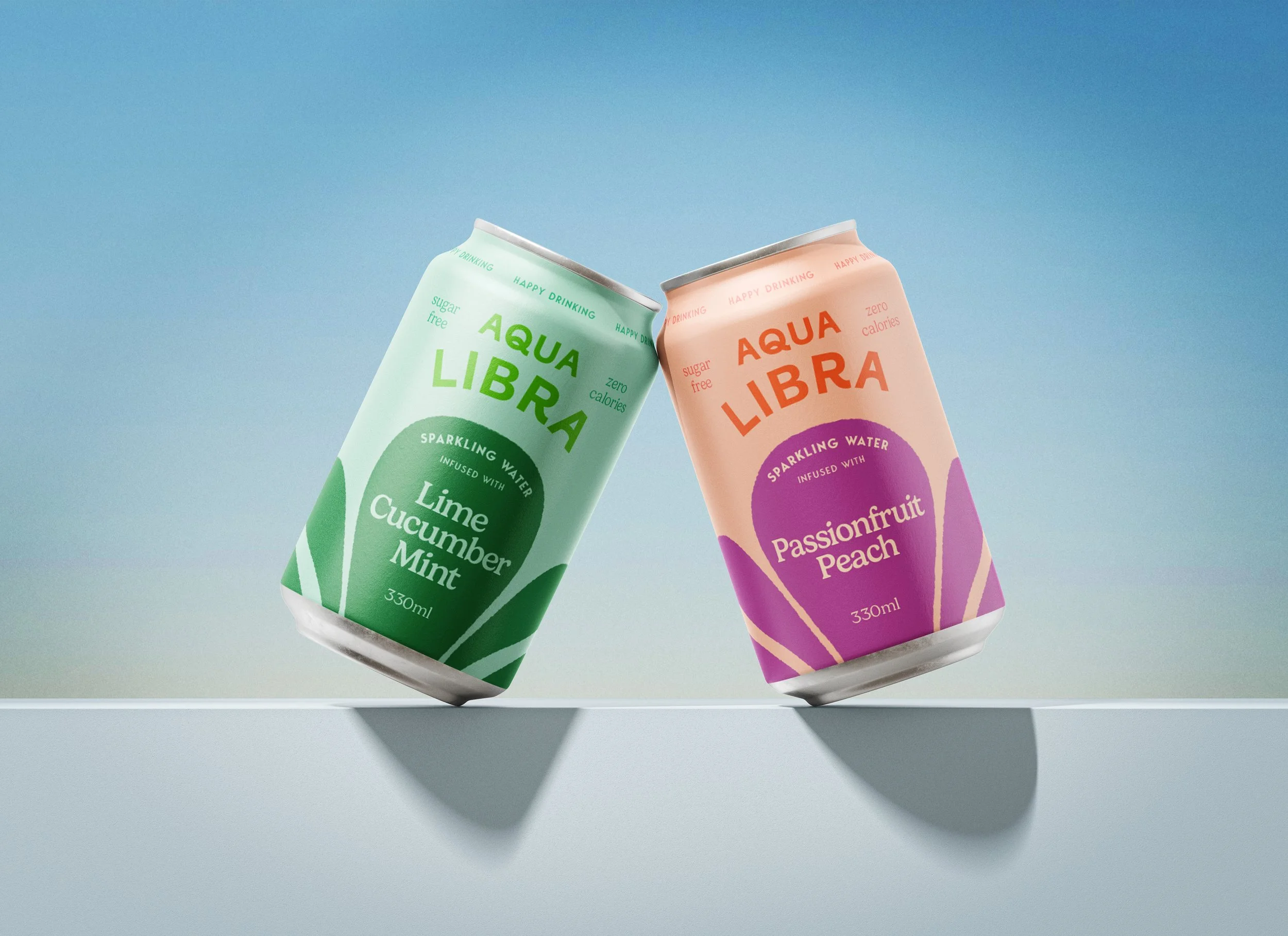
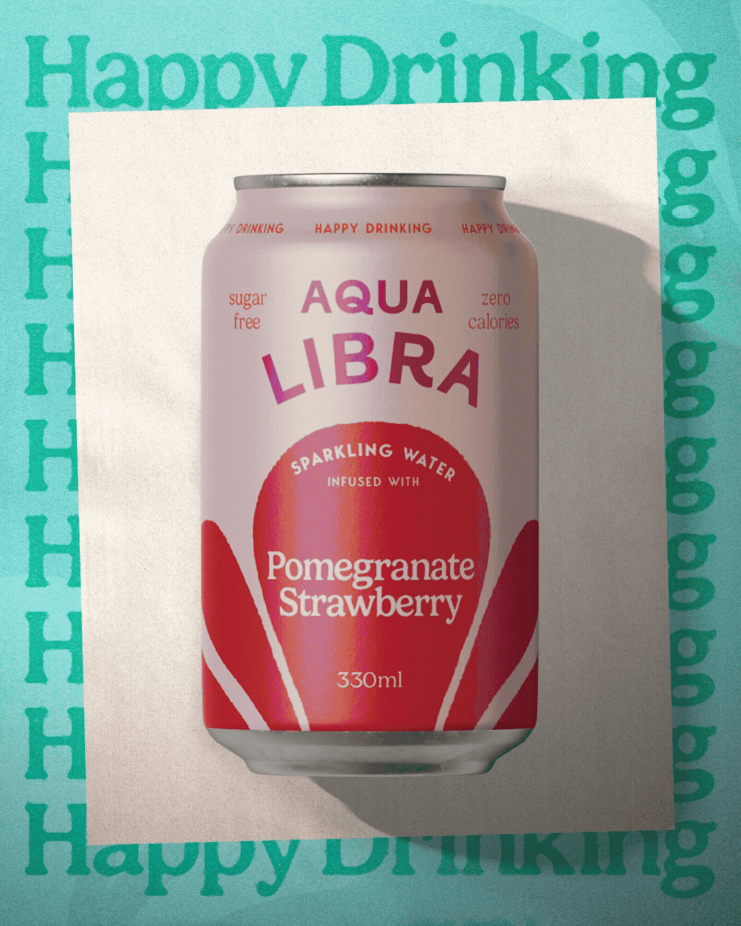
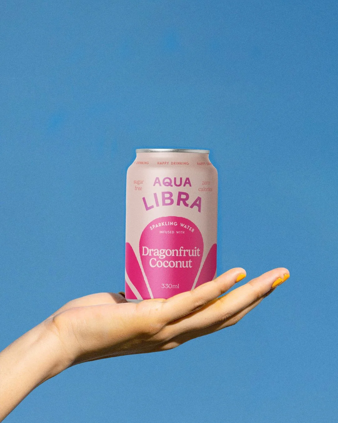
To bring this to life, we developed a simplified packaging design that embraced the joyful nature of the new positioning. A brighter colour palette and bolder, more minimal design created a flexible system capable of supporting Aqua Libra’s wide range of natural flavour combinations.
The packaging redesign would be launched alongside a campaign celebrating the new positioning, ‘Happy Drinking’, bringing a fresh sense of energy and optimism to the brand.
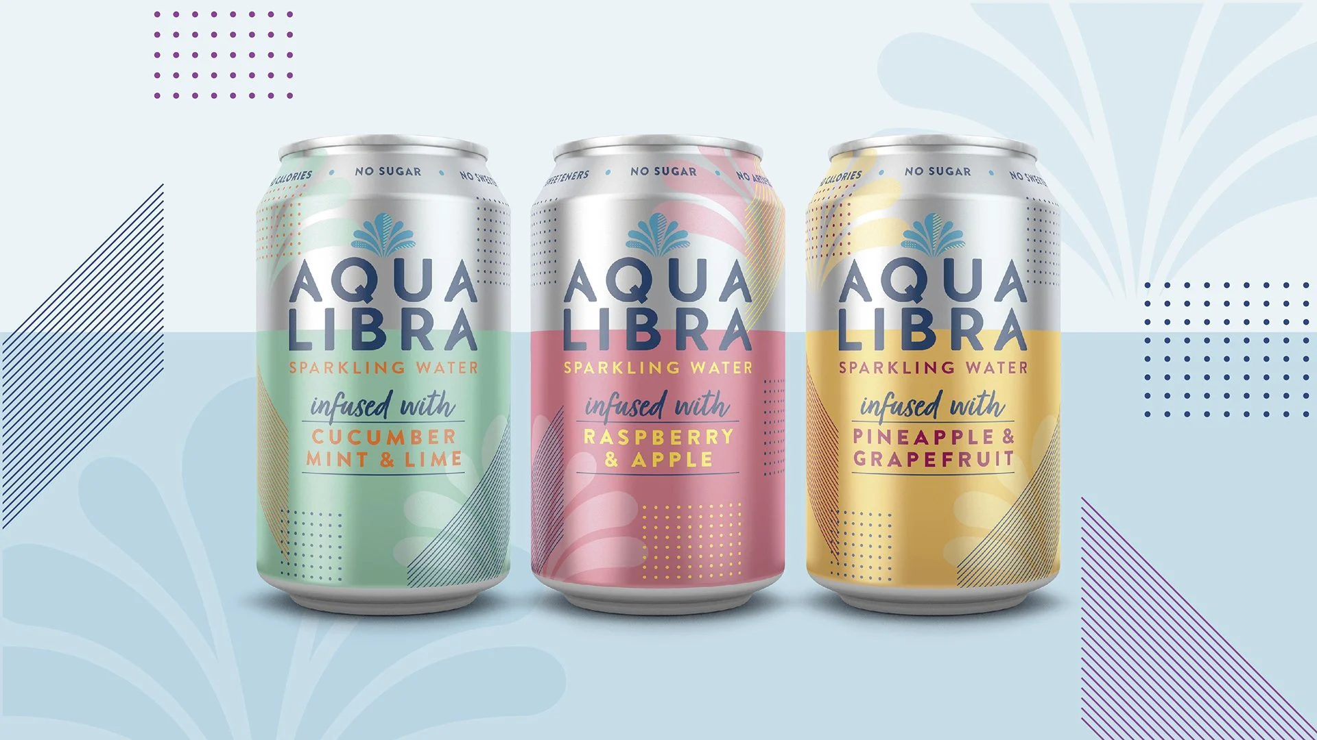
Pre-evolution
Our process began by looking back at Aqua Libra’s original designs. The arched type and layout carried a confident, joyful character, which inspired the direction for our reimagined logo and can design.
We combined this with a hand-drawn interpretation of the brand’s existing fountain illustration, elevating it to become the focal point of the new cans.


Otherway (2023)