Packaging DesignFortnum & Mason, renowned worldwide for their luxury offerings and expertise in fine tea blends, approached us with an exciting brief: to create a new range of teas celebrating special occasions throughout the year. These unique blends were crafted to mark meaningful moments, and the packaging needed to reflect the sophistication, joy, and thoughtfulness that Fortnum & Mason embodies.
-
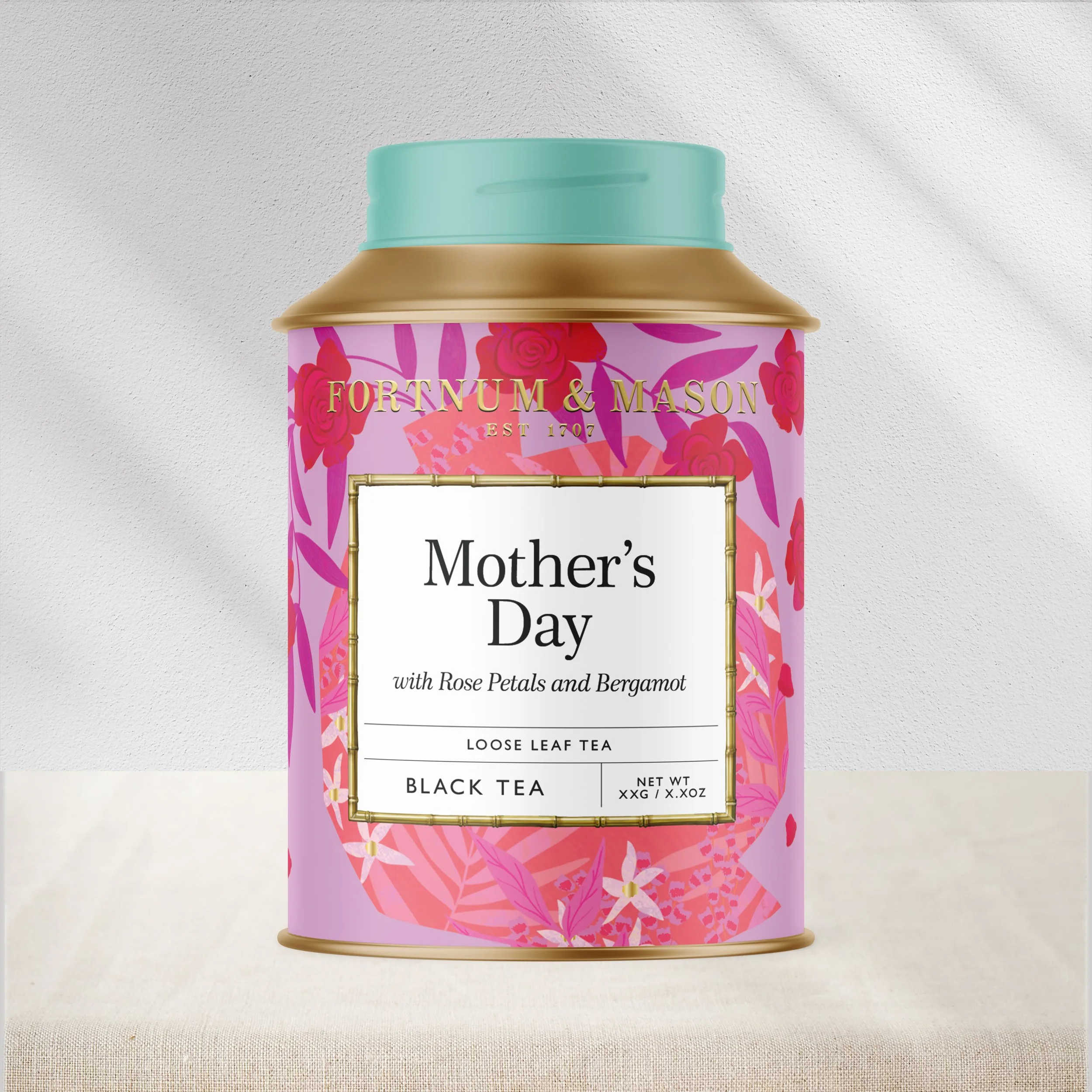
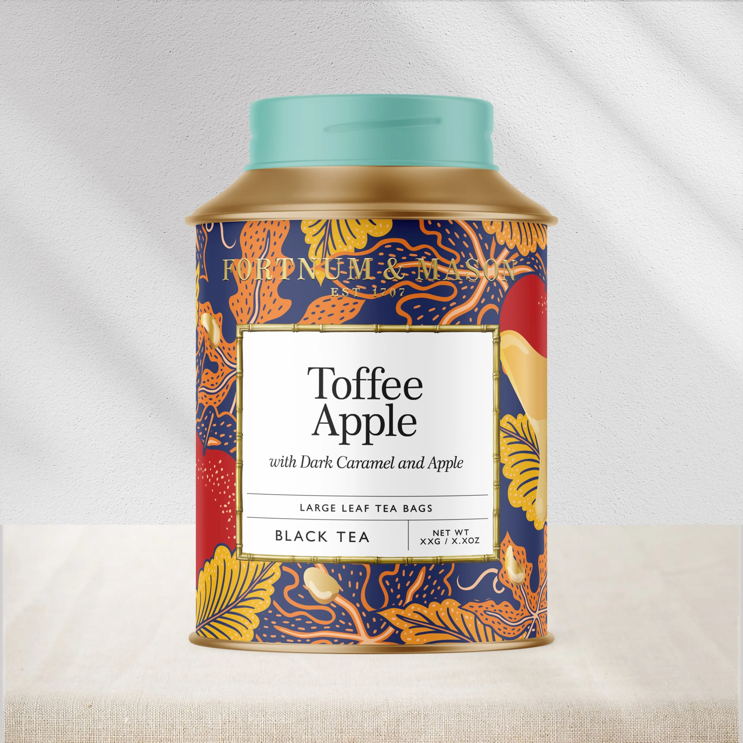
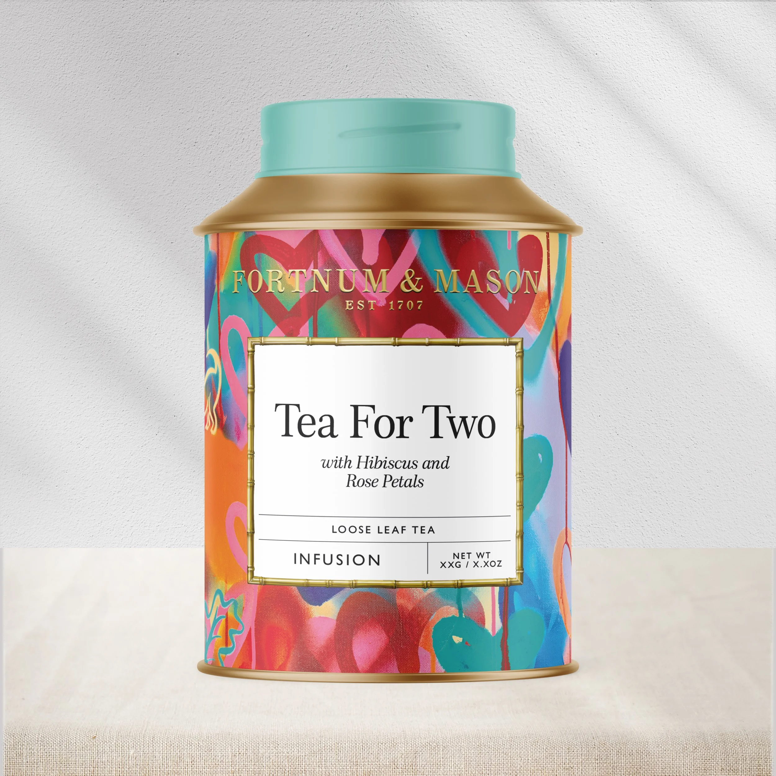
Inspired by the craftsmanship behind these exceptional blends, we created a range that celebrates the story behind each tea. Bold, bespoke illustrations were commissioned for every pack, ensuring each blend felt unique to its occasion while creating a beautifully curated and giftable collection.
Working with a range of talented artists, we developed an eclectic and joyful set of illustrations that capture the spirit of each moment – from celebrations to quieter rituals – adding emotion and storytelling to the tea-drinking experience.
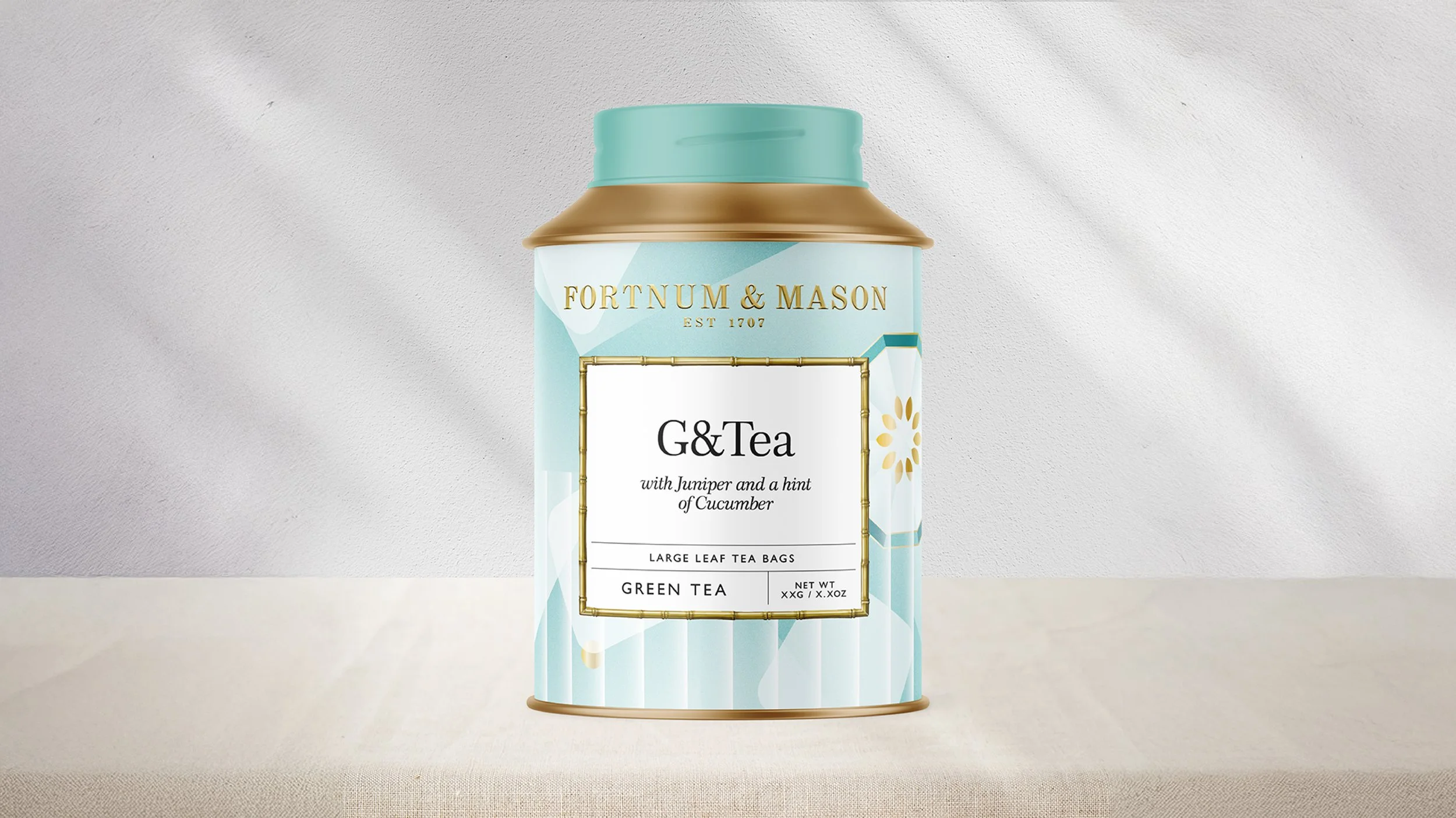
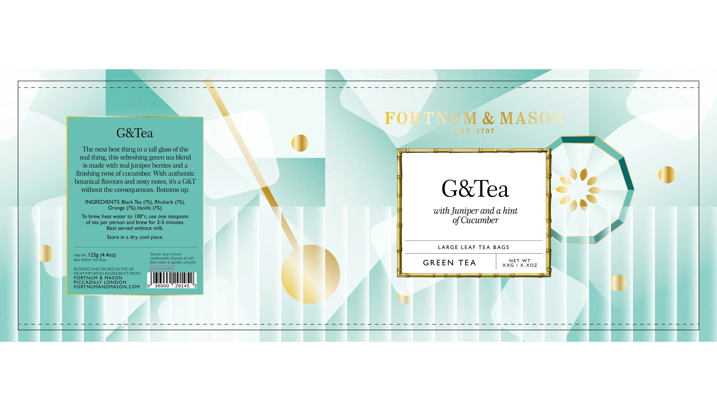
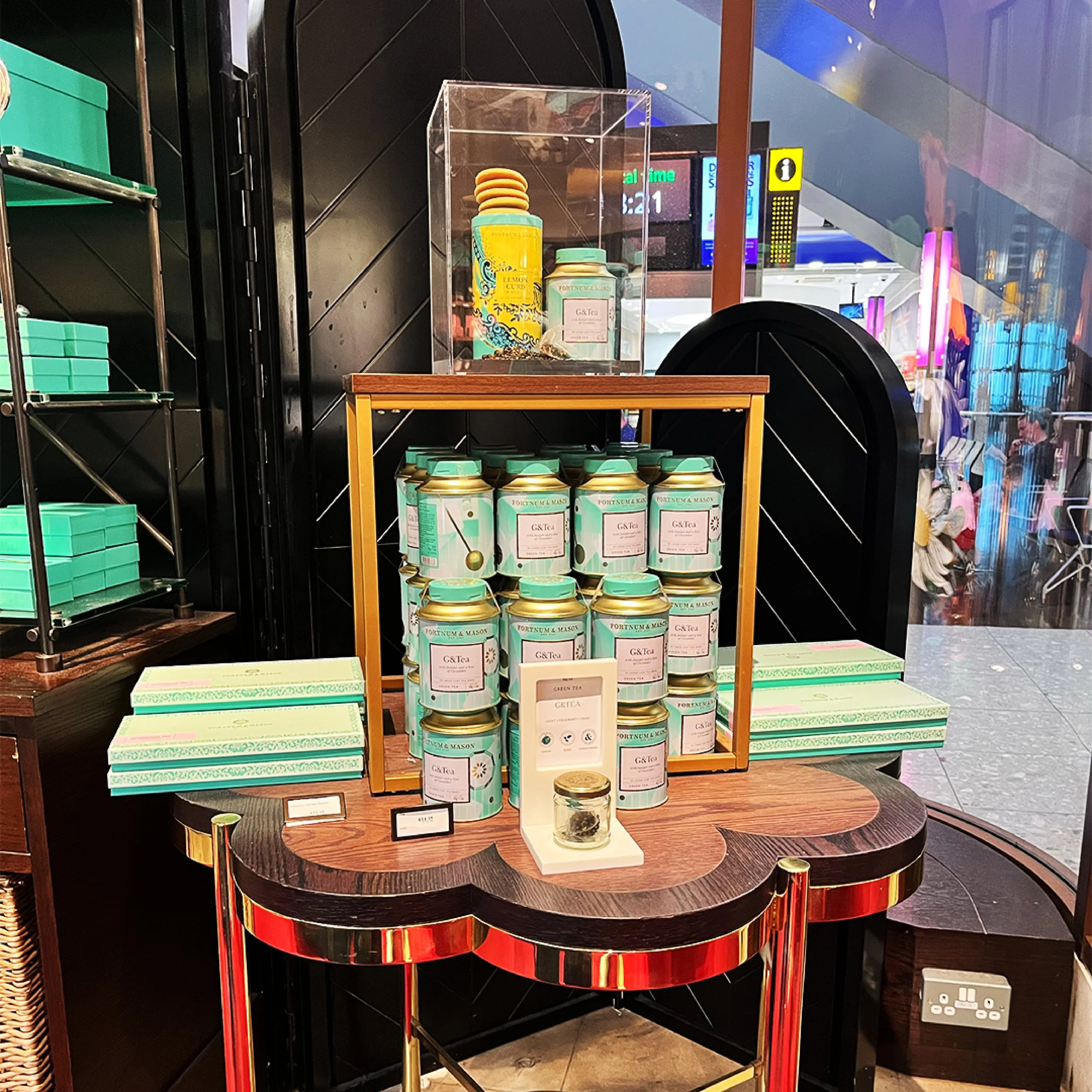
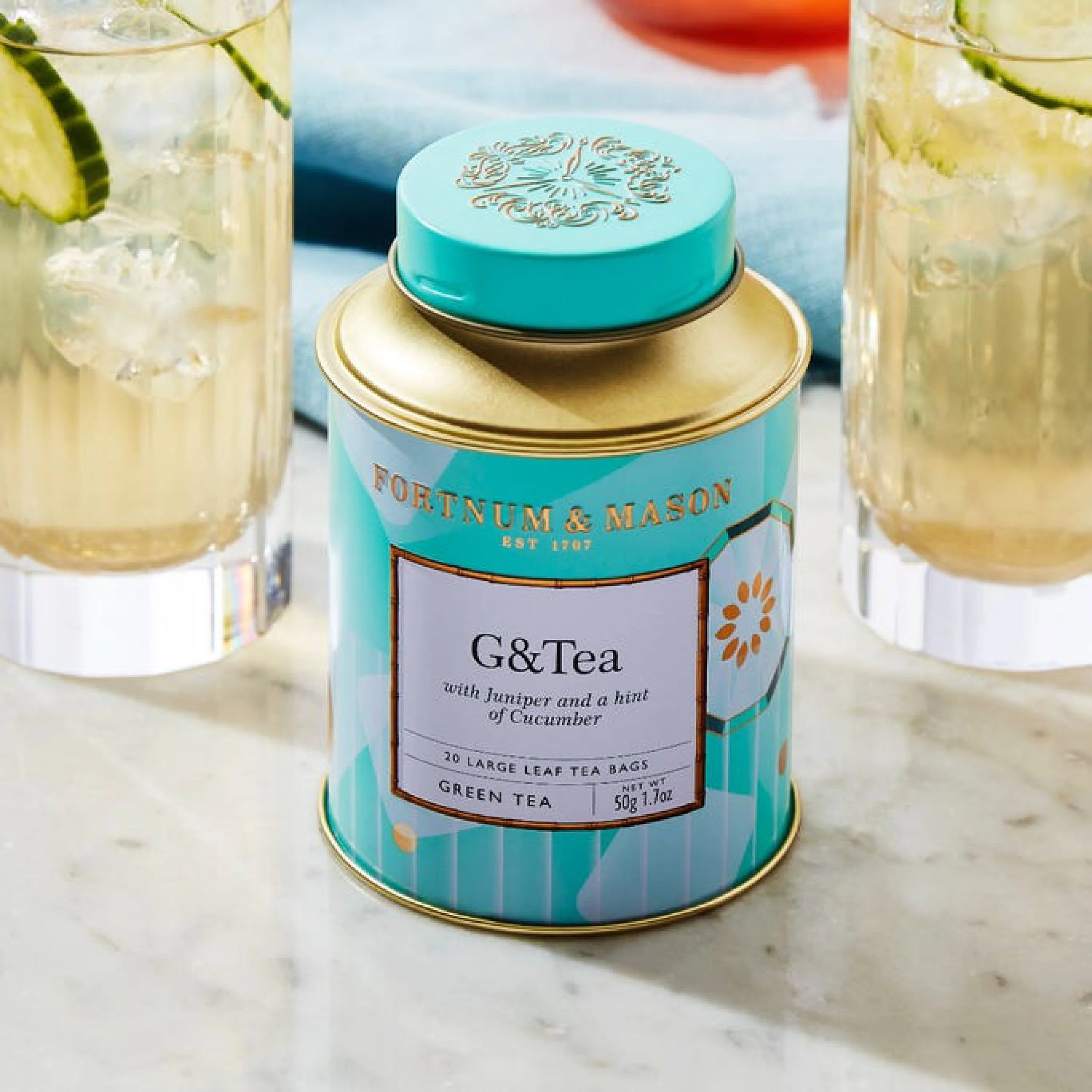
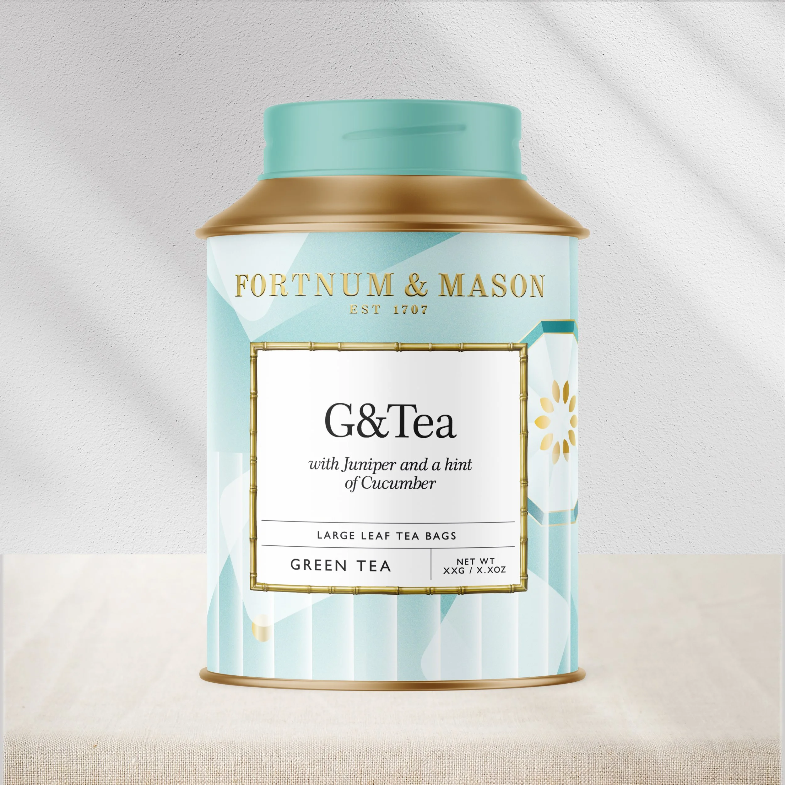
As part of the range, I illustrated Fortnum & Mason’s year-round G&Tea blend. Inspired by the crisp character of a classic Gin & Tonic, the design takes on an elevated graphic style, incorporating refreshing tones of Fortnum’s signature Eau de Nil to sit seamlessly within their iconic brand world.
A look at the full range, featuring commissioned illustrations from a talented group of artists.


Otherway (2023)