Brand Evolution + Packaginggraze first launched in 2008, revolutionising the snack market with their innovative concept of healthy pick-and-mix snack boxes. Over time, the market evolved and became crowded with numerous healthy snack brands, making it harder for graze to stand out. To reclaim their position as 'snack pioneers' and appeal to a more modern, health-conscious audience, graze approached us with a clear challenge: to refresh their brand and make it shine in a saturated market.
-
We collaborated closely with graze to breathe new life into their brand, starting with a bold and characterful redesign of their logo. Subtle details, such as hidden seed-like shapes and understated smiles, were incorporated to reflect their playful identity.
Next, we took a deep dive into their typography and colour systems. It became clear that graze needed a dynamic and complex framework to accommodate their growing variety of flavours while ensuring the brand remained instantly recognisable.
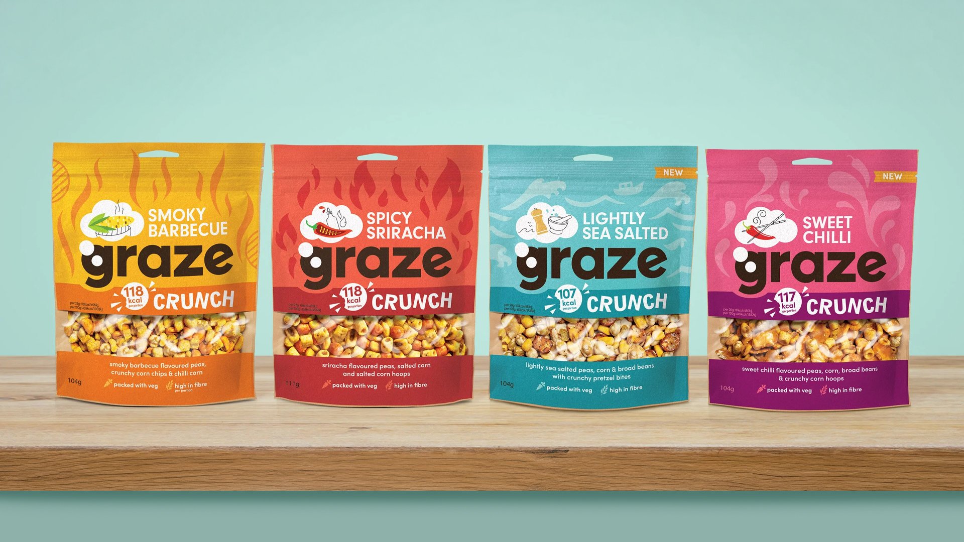
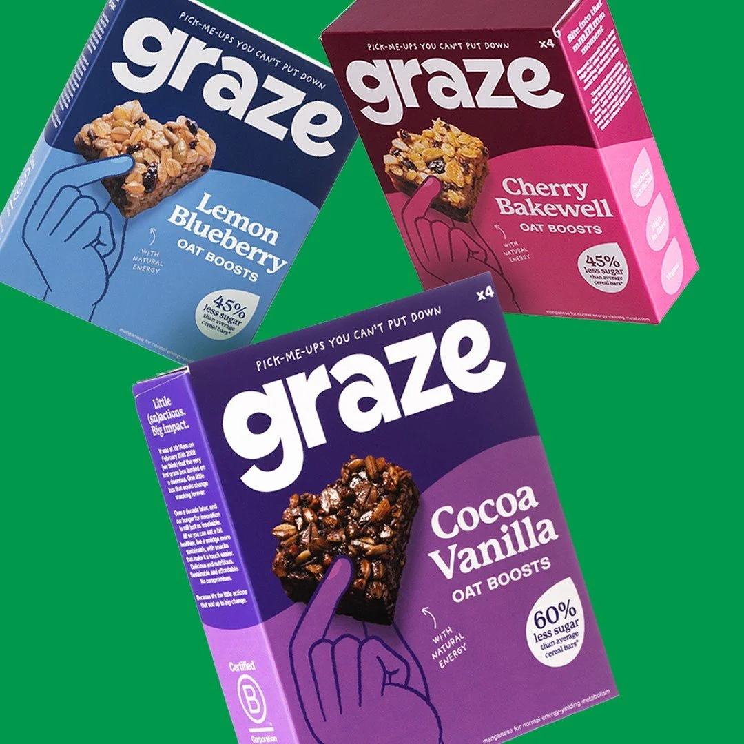
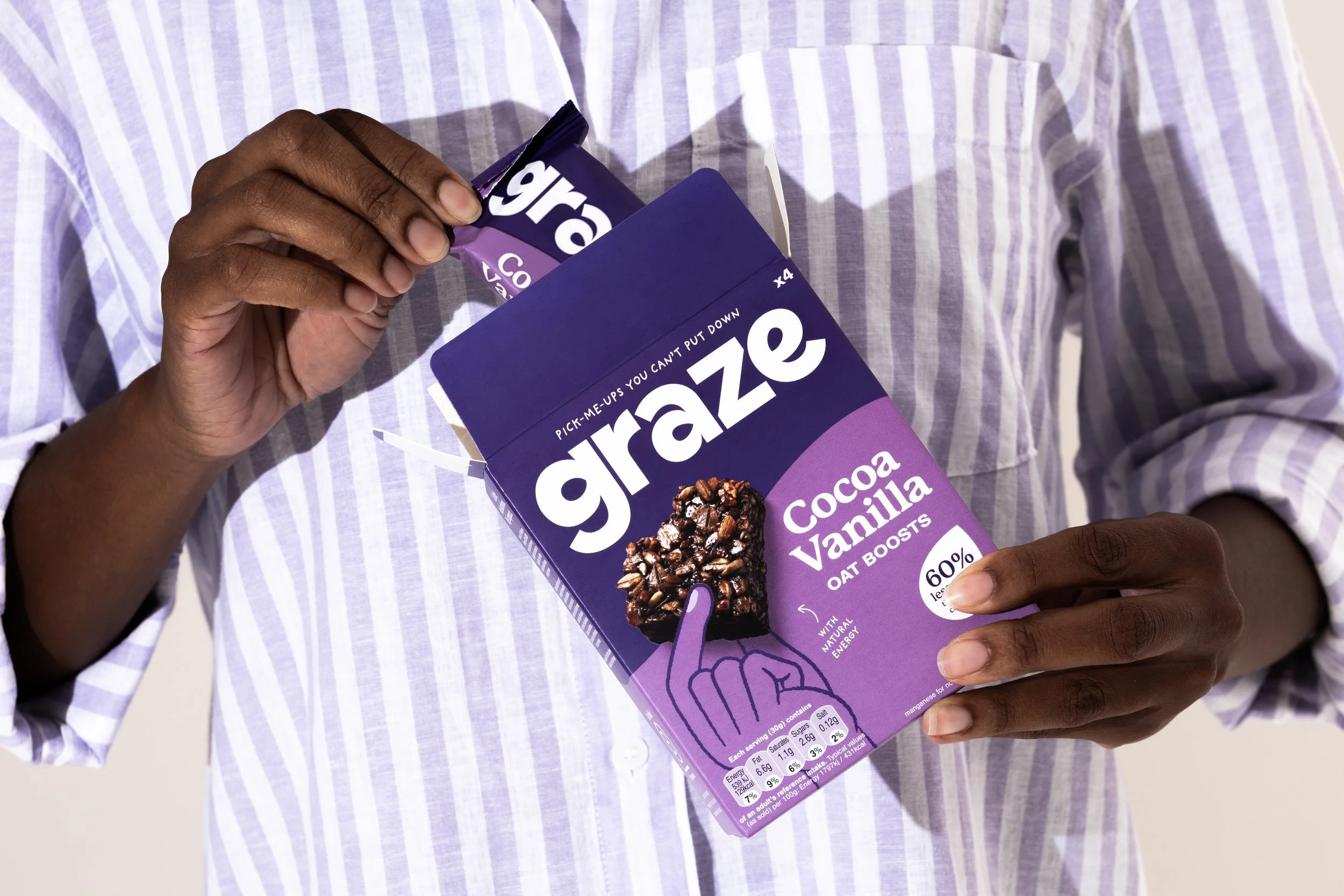
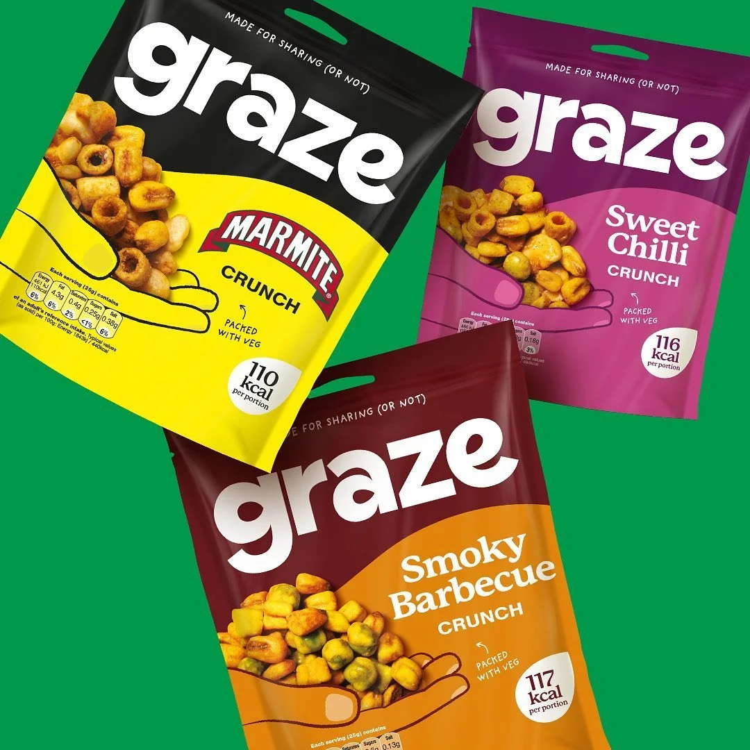
Our solution was a flexible type system that captured the brand's personality, paired with their proprietary "graze green" and an expanded brand colour palette. This included a vibrant "graze rainbow," designed to flex across their current and future product ranges, adding variety without sacrificing consistency.
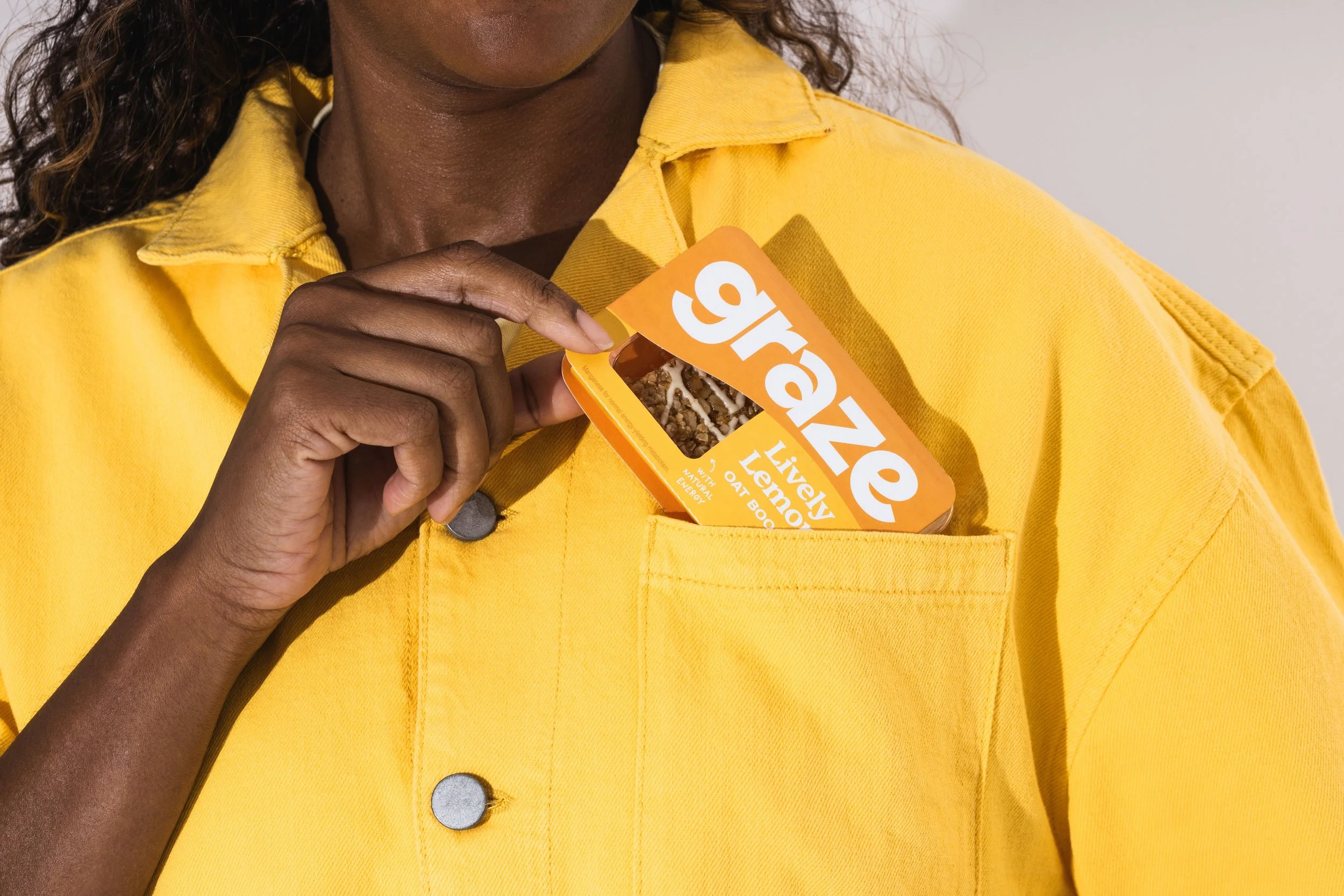
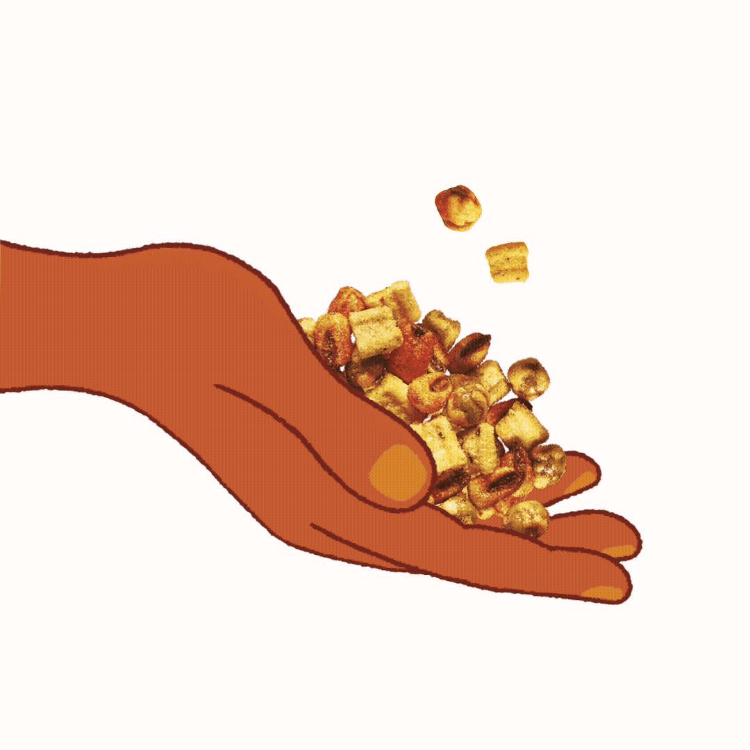
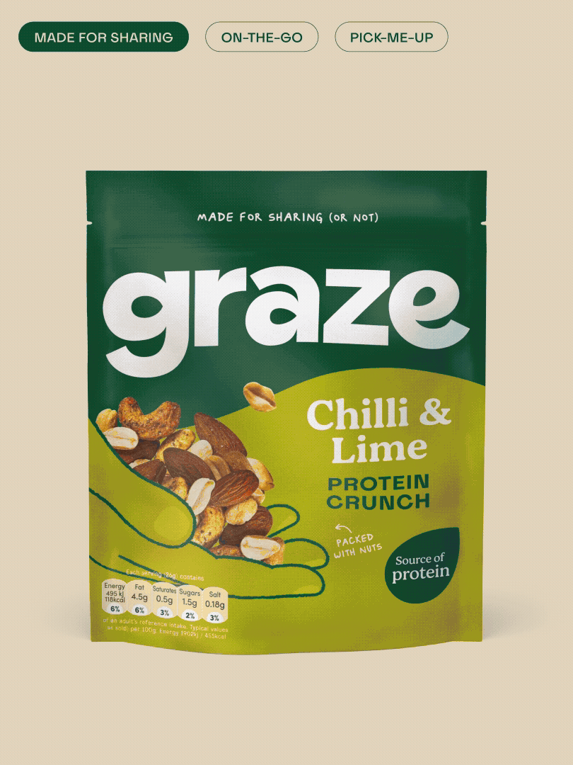
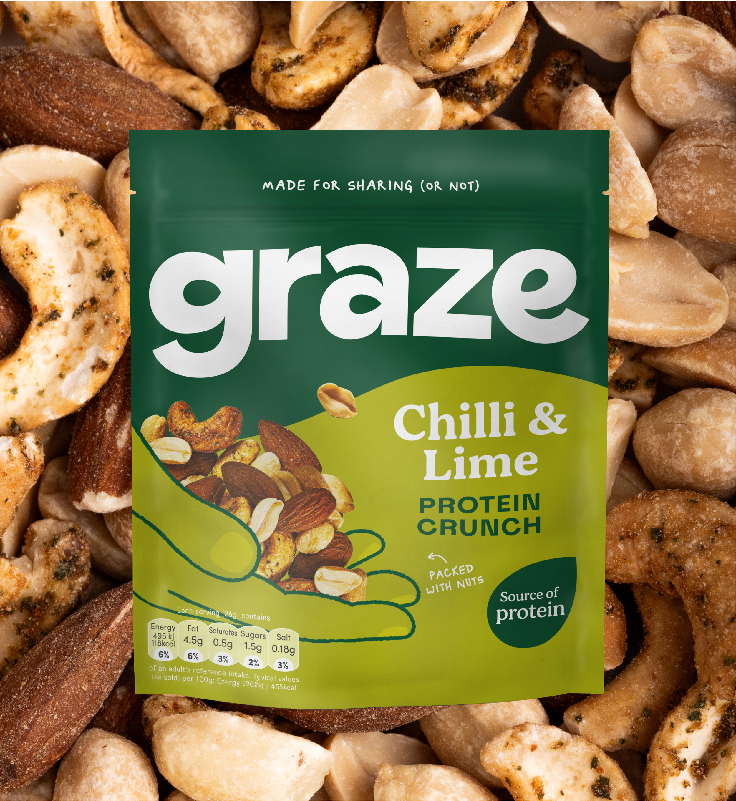
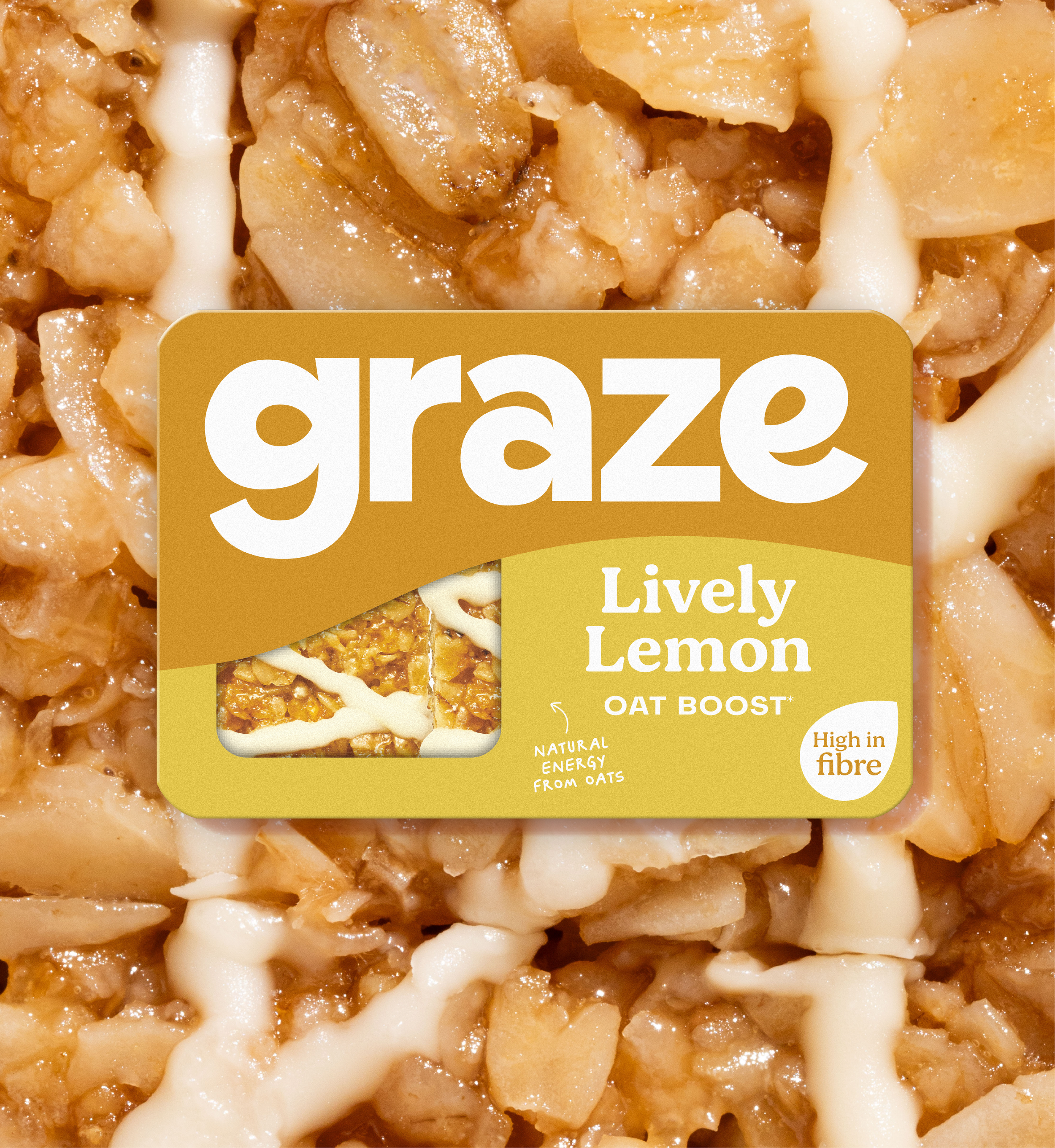
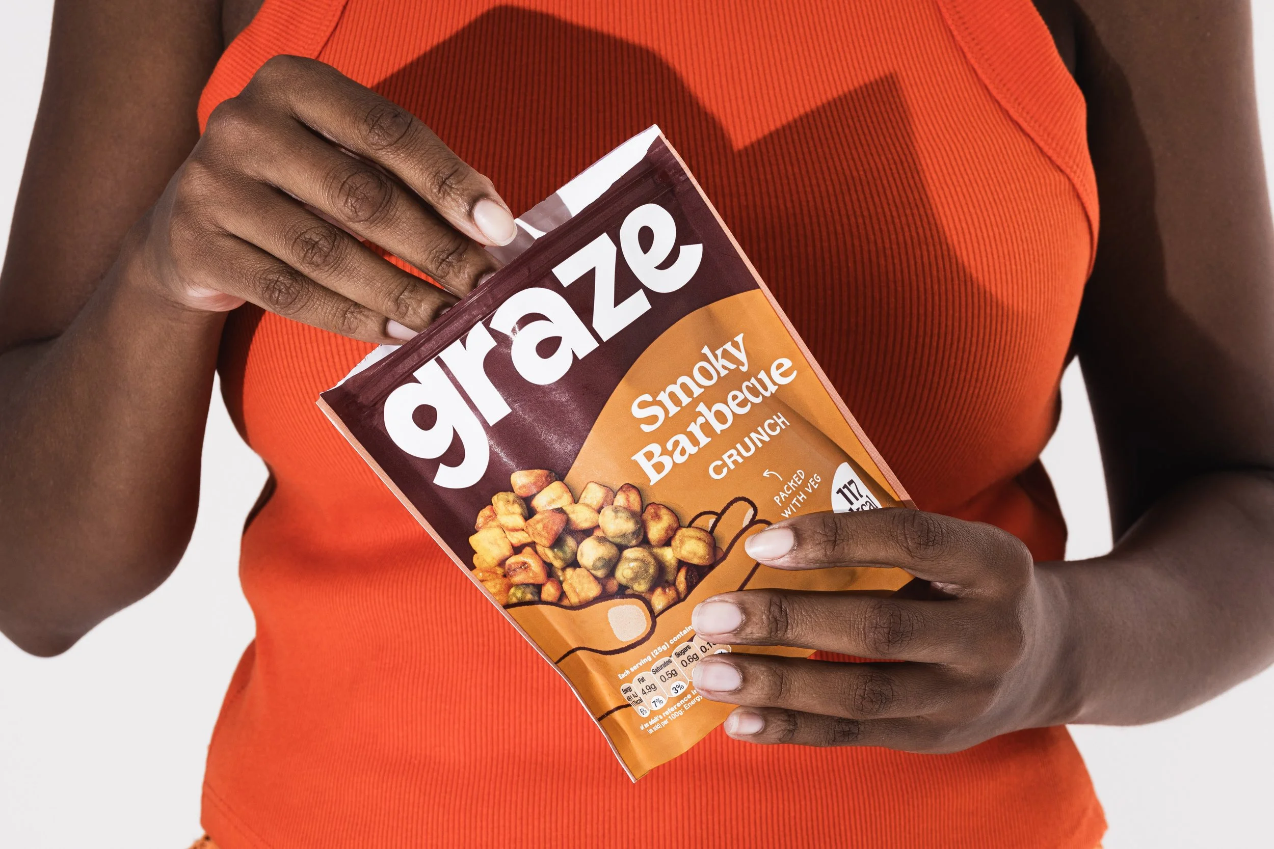
Finally, we introduced the concept of ‘the hands that graze’ to add a playful and uniquely ownable element to the brand identity and packaging. A series of illustrated hands was incorporated to anchor the product imagery in a way that felt both simple and tactile, enhancing the human connection while providing visual variety. These hands became a key feature, adding warmth and personality to the brand and helping Graze stand out on crowded shelves.
Pre-evolution
Creating a snacking icon
We worked closely with graze to refresh the brand, beginning with a bold, characterful logo redesign featuring subtle details like seed shapes and hidden smiles to reflect its playful identity.
We then evolved the typography and colour systems, creating a flexible type framework alongside their signature “graze green” and an expanded palette. This included a vibrant “graze rainbow” to support a growing range of flavours while keeping the brand instantly recognisable.

The hands that graze
We introduced ‘the hands that graze’ as a playful, ownable element of the brand identity. Illustrated hands frame the product imagery, adding warmth, personality and a human touch that helps Graze stand out on shelf.
A system built around taste and variety
Building on the graze colour rainbow concept, we created a flexible packaging system organised by taste. This allows the range to expand easily while maintaining strong on-shelf brand recognition.


Otherway (2023)