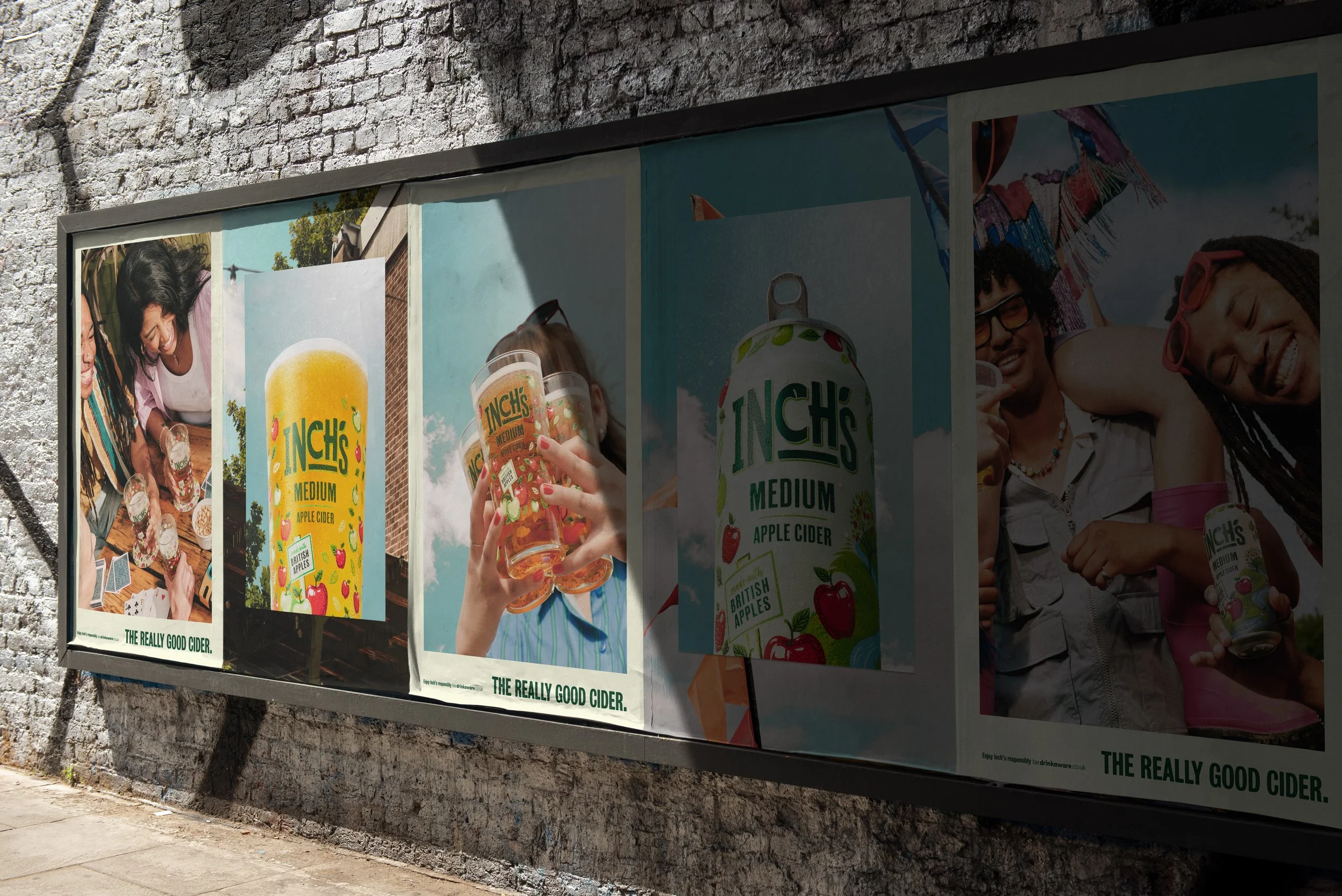
Art Direction + CampaignCompared to many other British ciders, Inch’s has become known as the go-to choice for younger, city-based drinkers. In a bold step for the brand – previously recognised for its product-led photography, painted blue skies and apple illustrations – Inch’s wanted to connect more meaningfully with its audience and the occasions that bring people together over cider.
-
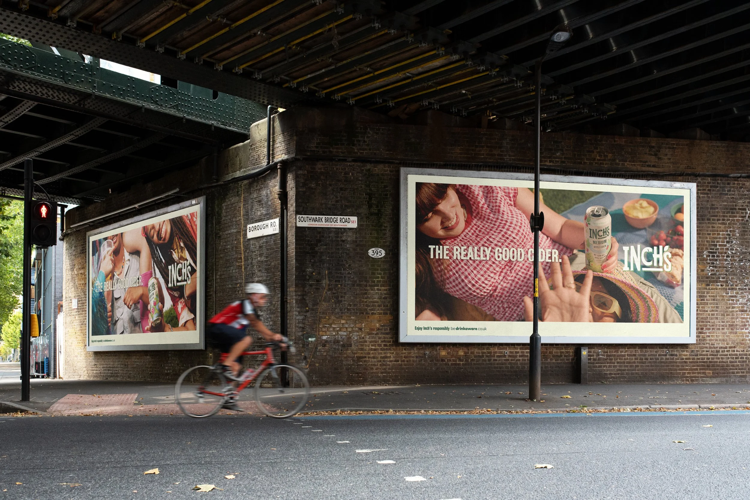
In response, we developed a new photography direction that places Inch’s at the heart of authentic summer moments. This led to the creation of Inch’s Moments – a joyful, naturalistic style capturing friends coming together in relatable, sun-soaked settings.
The campaign was designed with flexibility in mind, allowing it to evolve alongside the brand’s growing recognition and giving Inch’s multiple ways to champion and celebrate its refreshed visual identity.
Inch’s have become known for their bold campaign style - bright painted blue skies, taste-led product photography and signature witty tone of voice. For the next phase of its evolution, it needed to go further: deepening its connection with drinkers and building a more meaningful brand experience.
2024-25 campaign
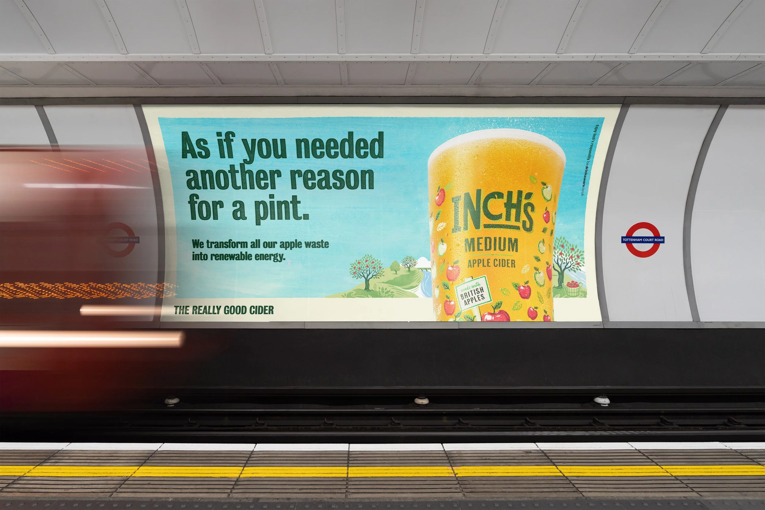
Introducing ‘Inch’s Moments’
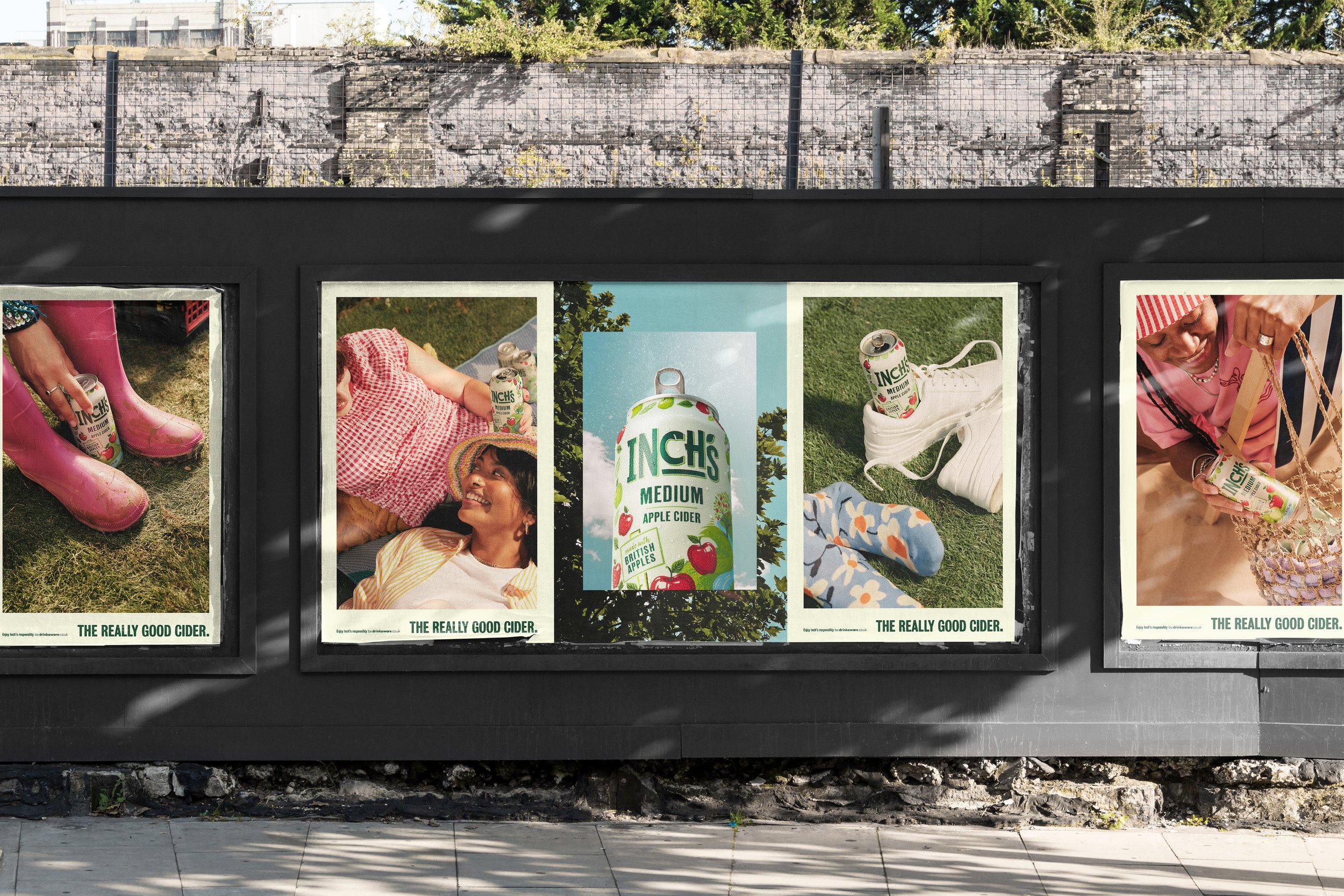
We defined five relatable scenarios rooted in the summertime moments of Inch’s drinkers. From there, we built a flexible system of hero shots for each – forming the foundation of the campaign’s art direction. The result brought greater emotional depth and a stronger sense of authentic occasion to the Inch’s brand.
Building a scalable system
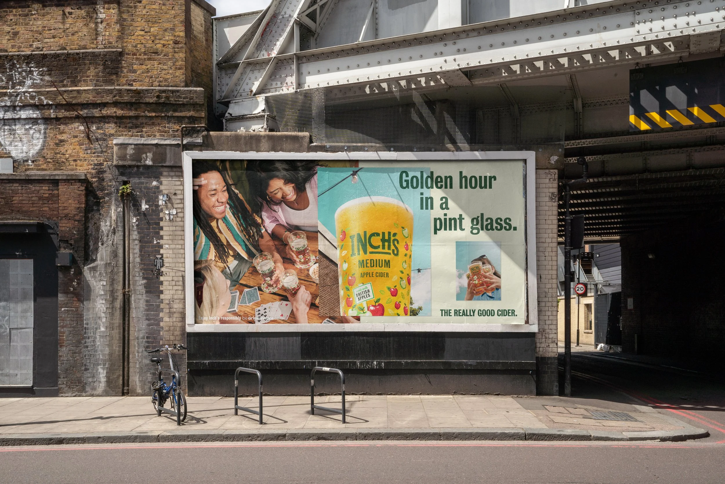
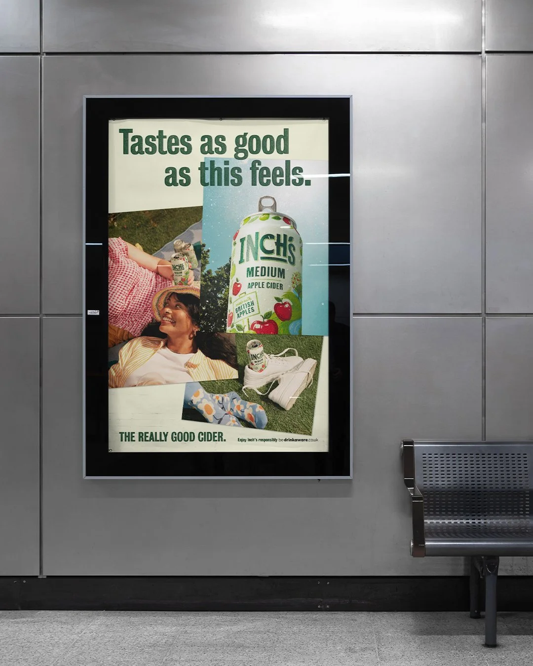
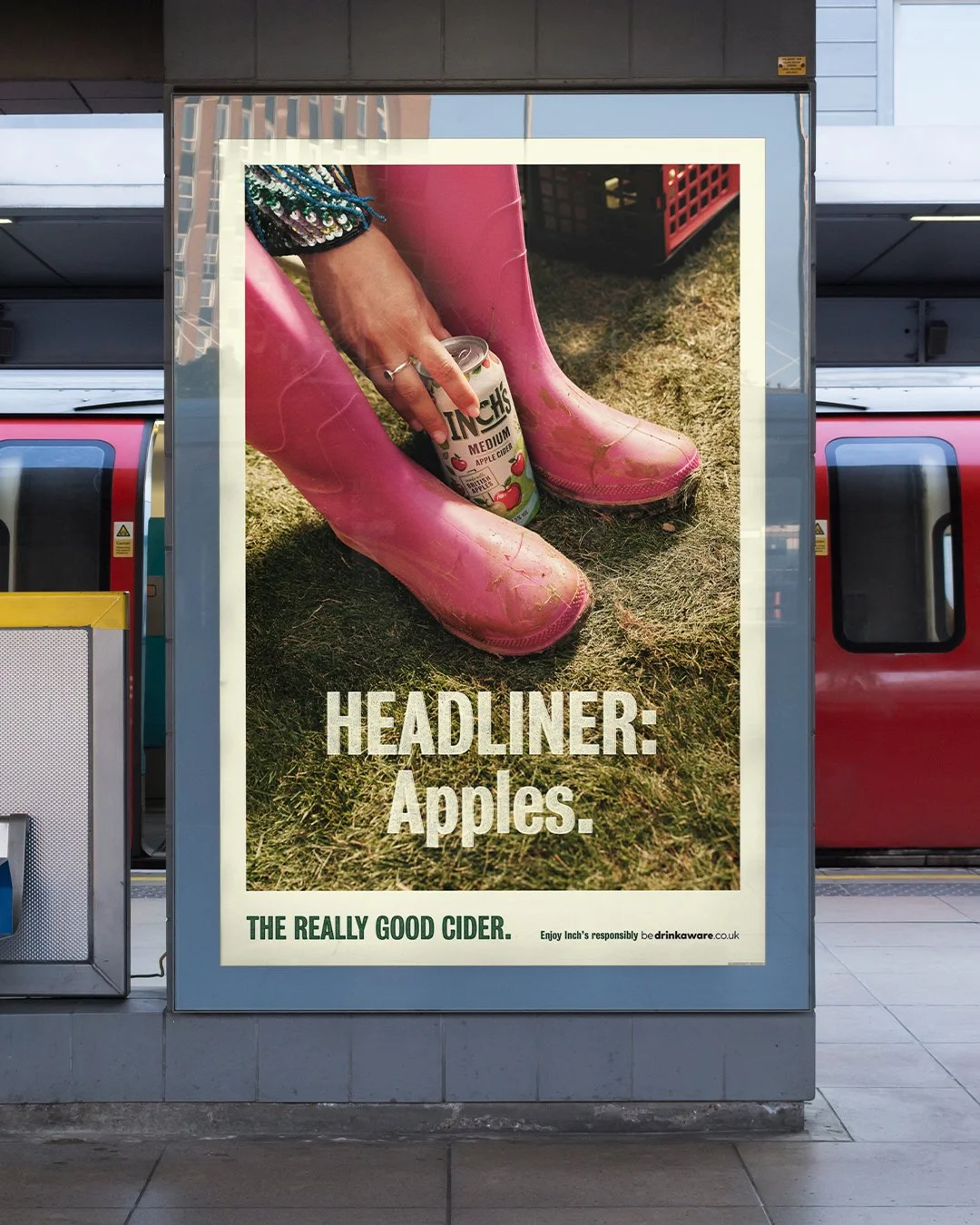
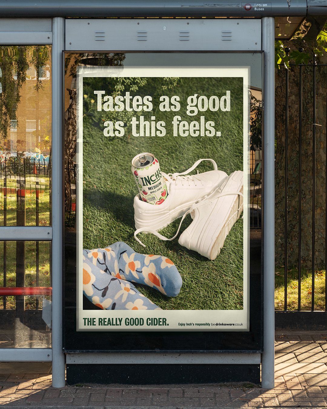
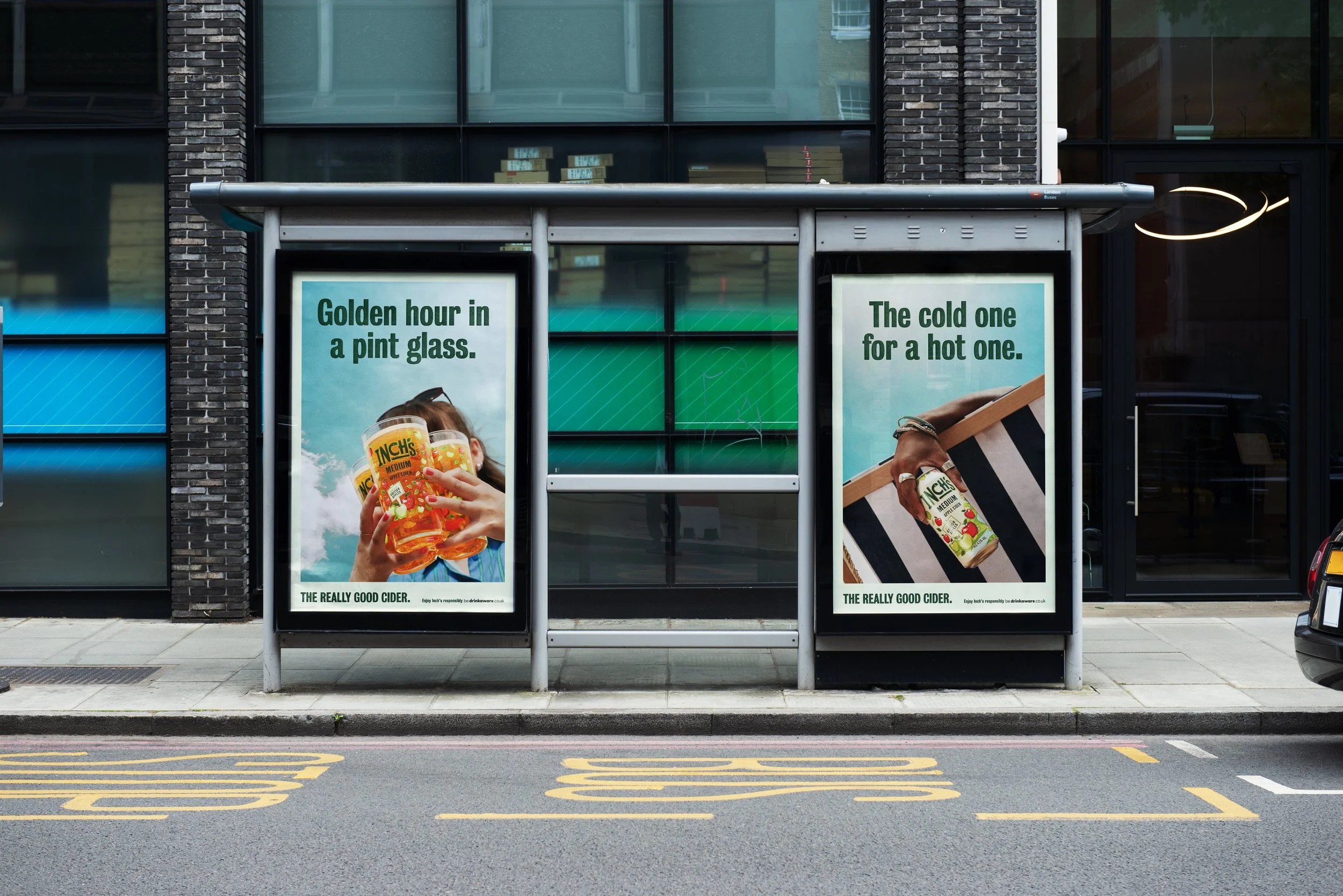
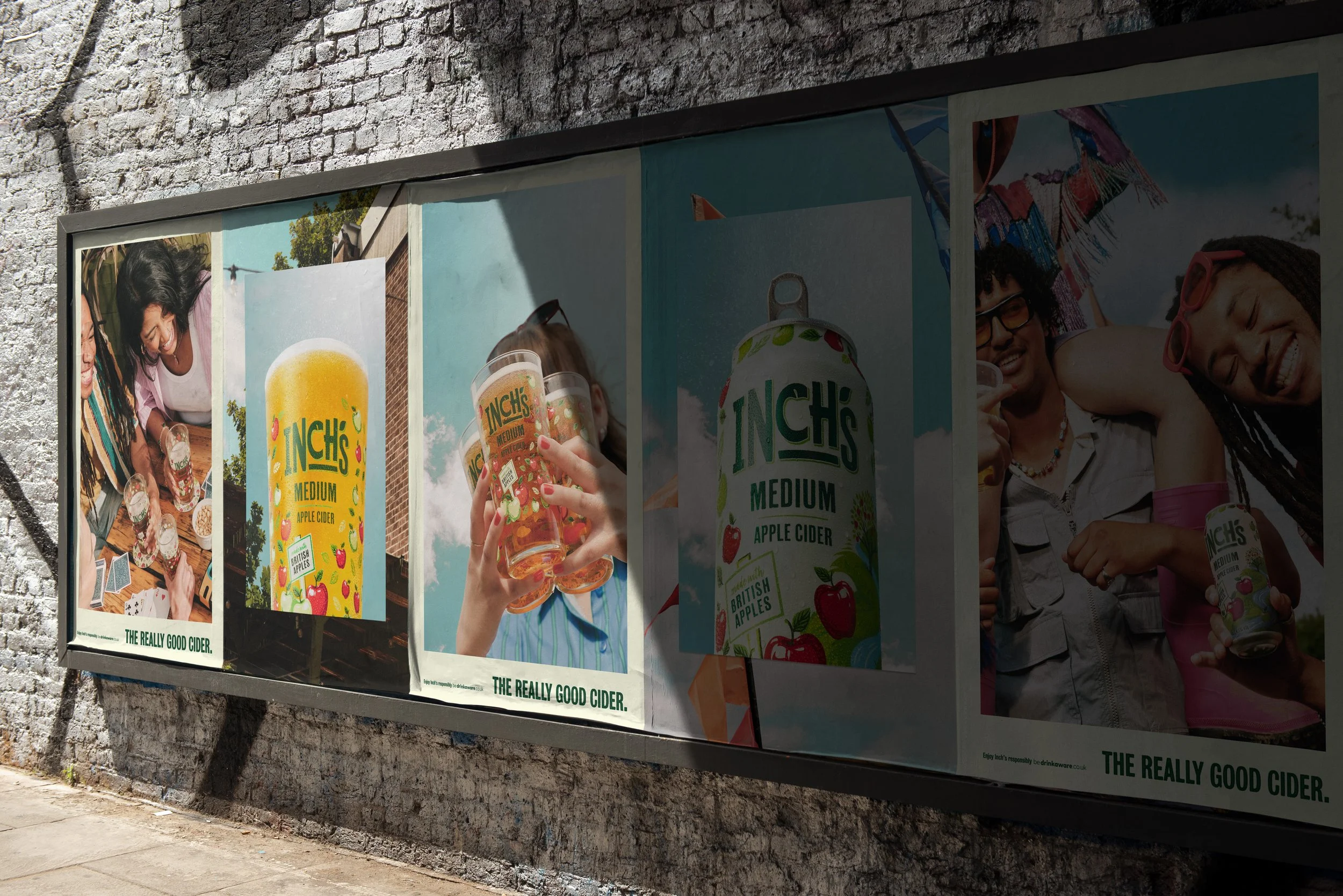
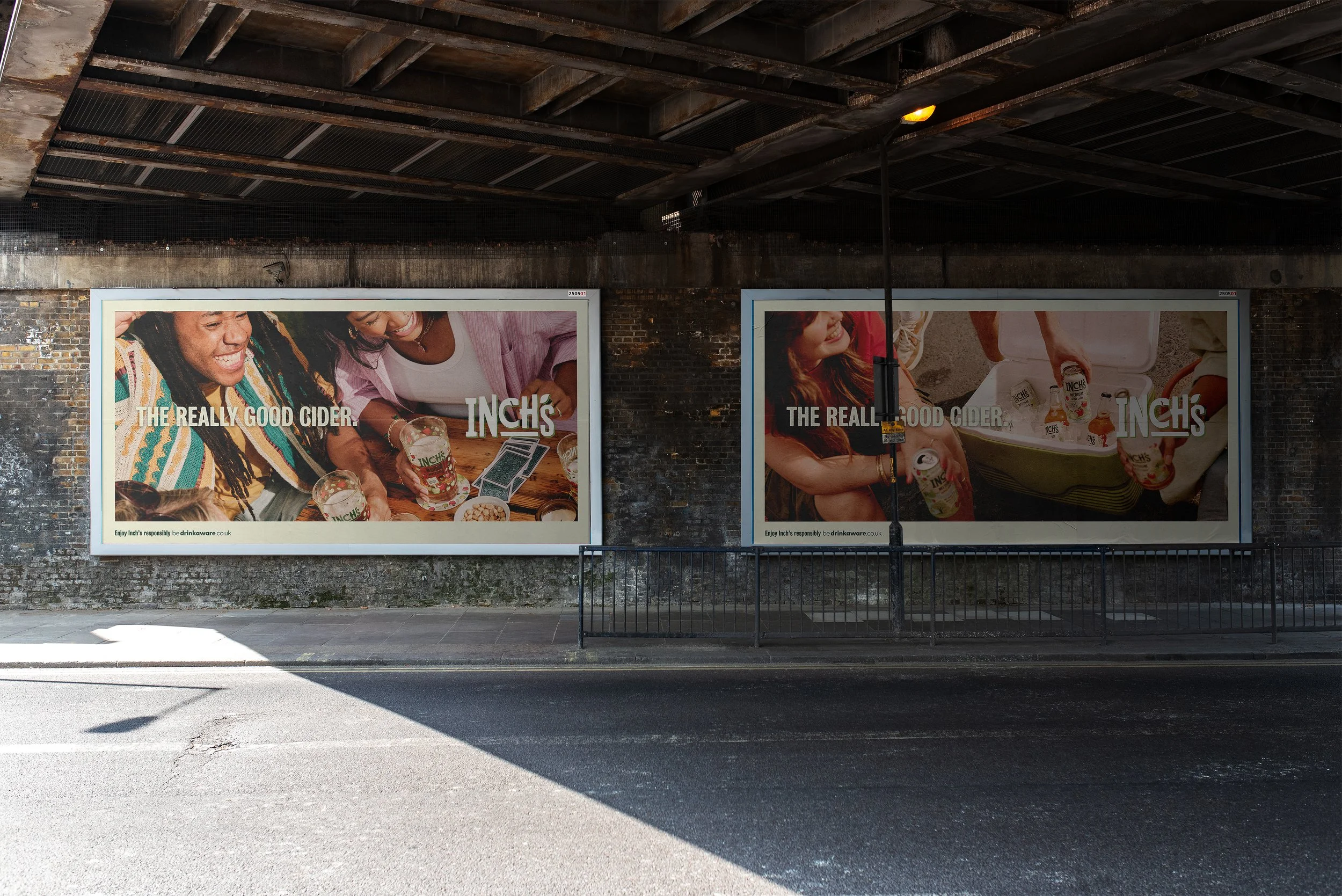
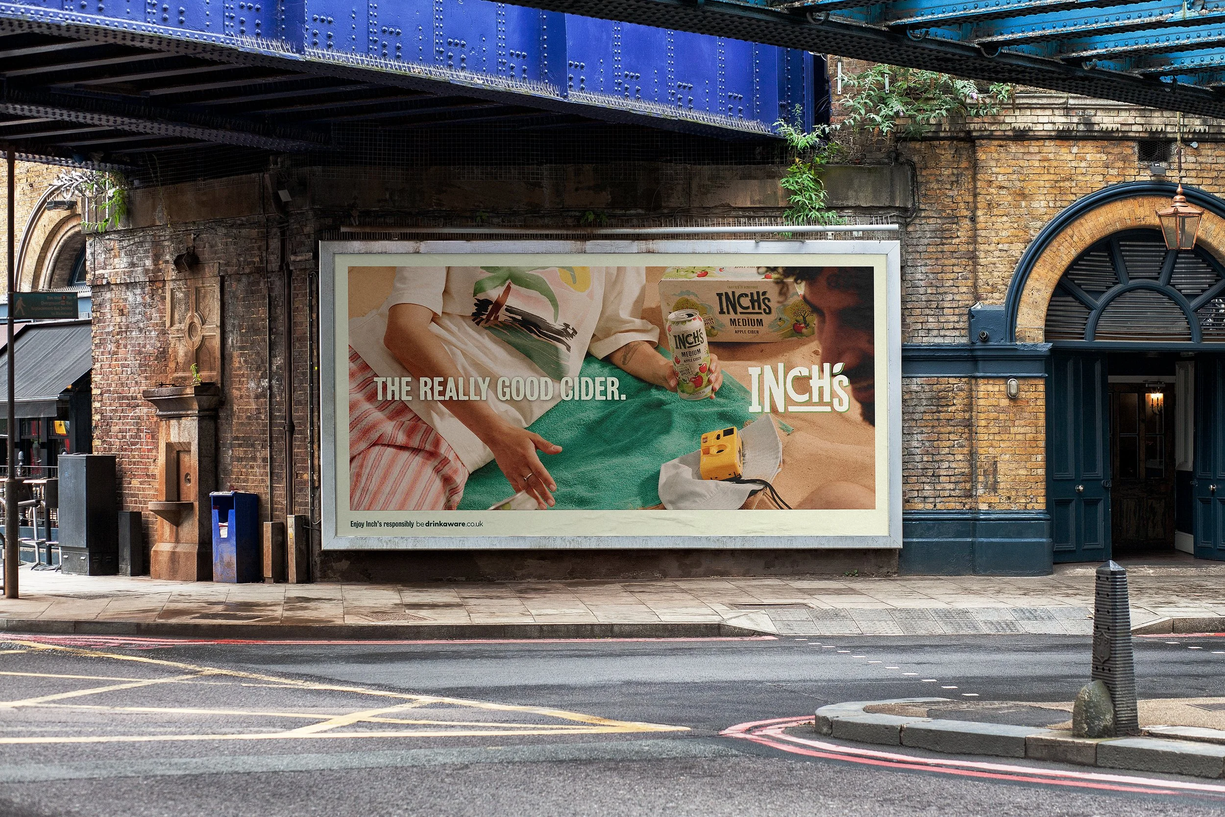
As the new art direction pushes Inch’s into a distinctly new space, we developed a scalable system to build recognition through photography. Phase one (launching April 2026) introduces a collaged approach — retaining the raw edge and signature tone of voice of previous Inch’s campaigns while signalling a confident step forward. Phase two and three gradually step the brand further away, allowing the photography to do more and more heavy lifting for the brand.
Phase One
Phase One
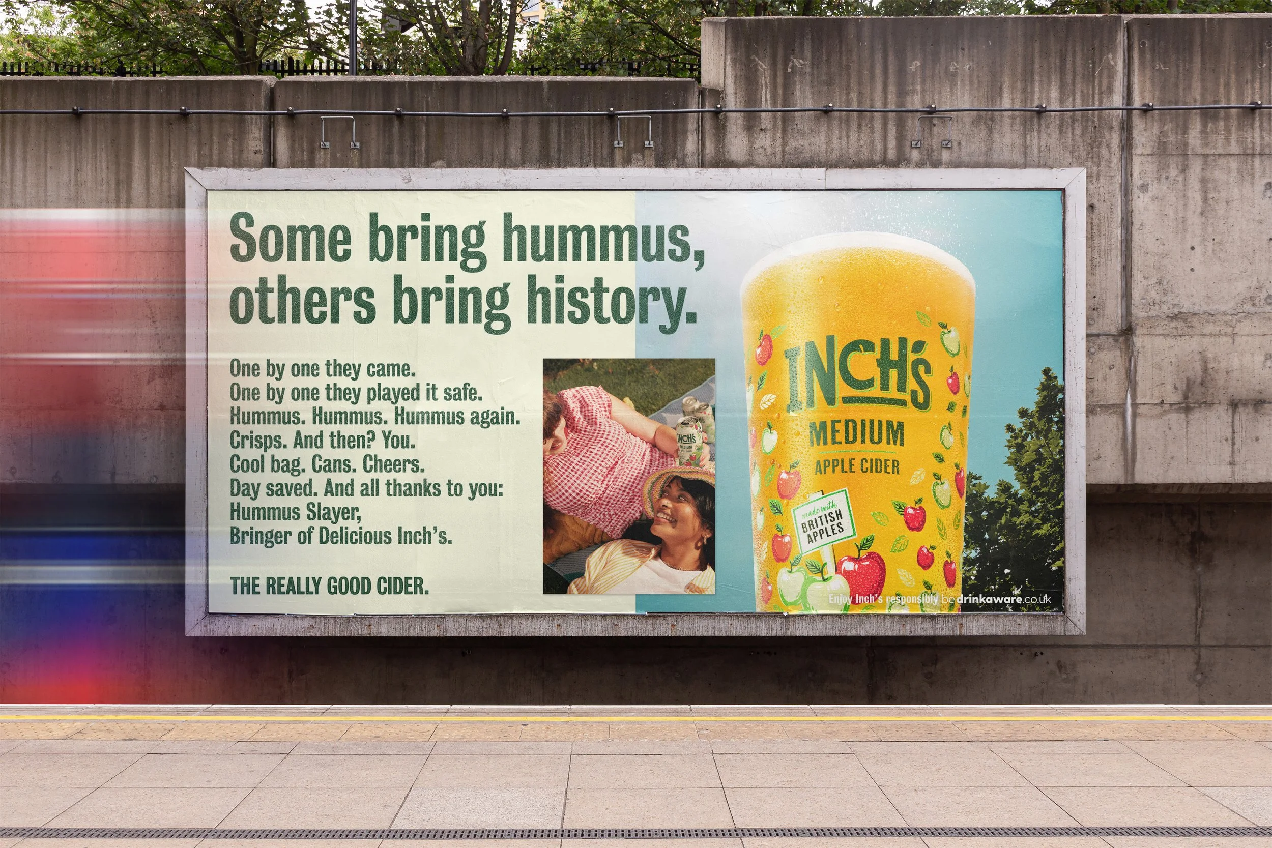

Phase Two
Phase Two
Phase Three
Phase Three
Otherway (2026)