Brand Evolution + PackagingRheal are experts in natural nutrition that really works. What started as a passion project in 2016 has grown into a leading brand in the natural nutrition market.
Over time, however, the brand began to feel lost, and its packaging had started to look dated. Rheal approached us to help them reconnect with their purpose – creating a refreshed brand and packaging system that could stand out in an increasingly crowded market and support the growth of their expanding range.
-
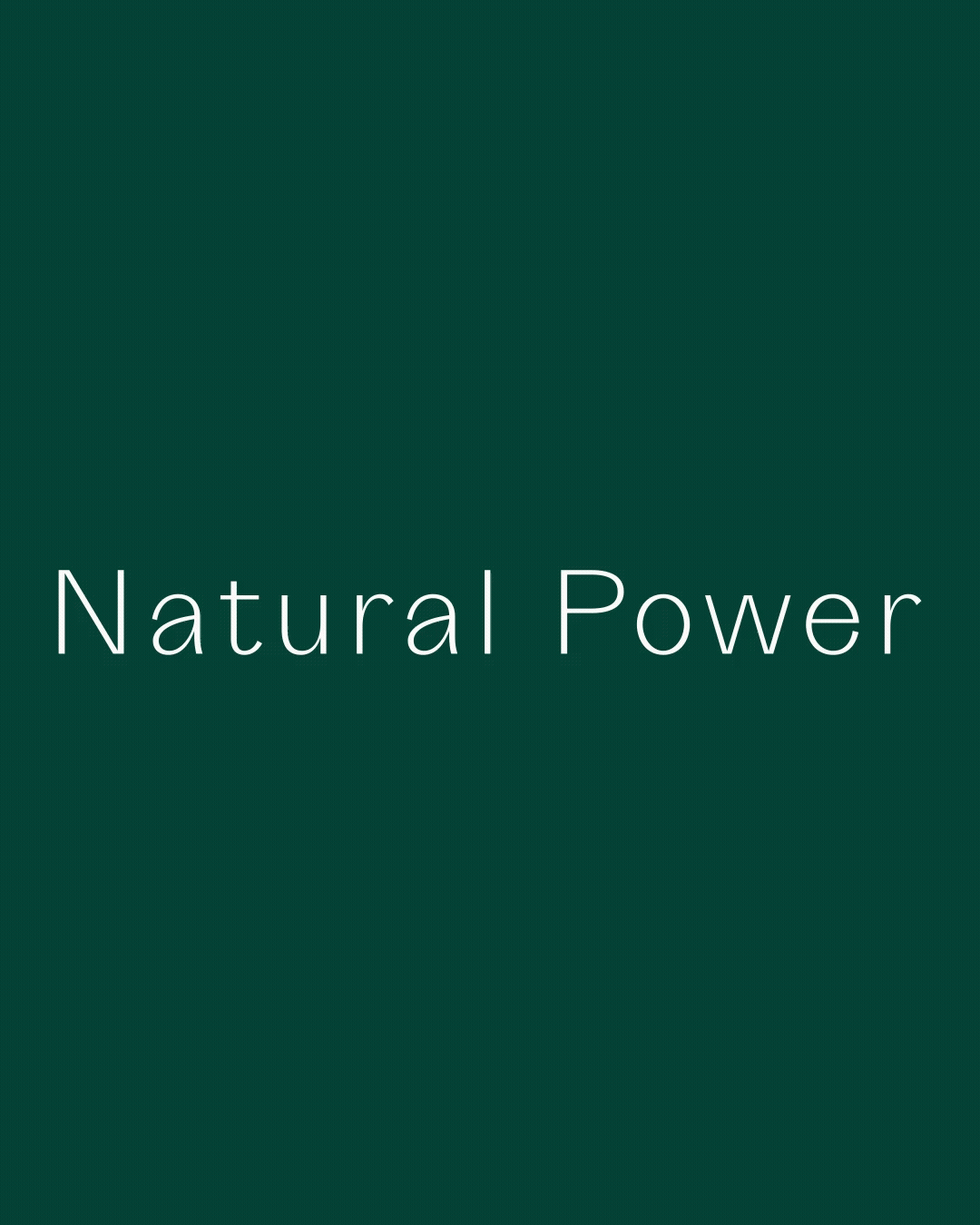
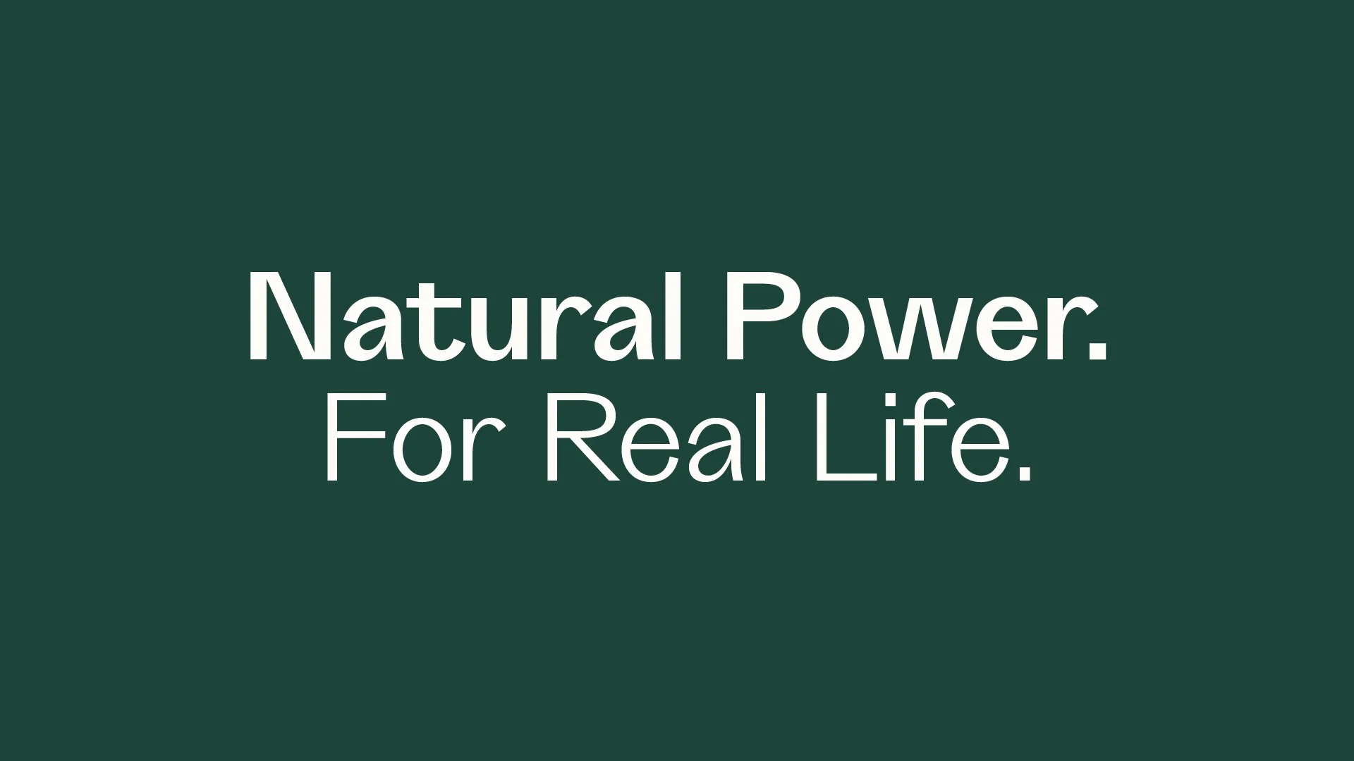
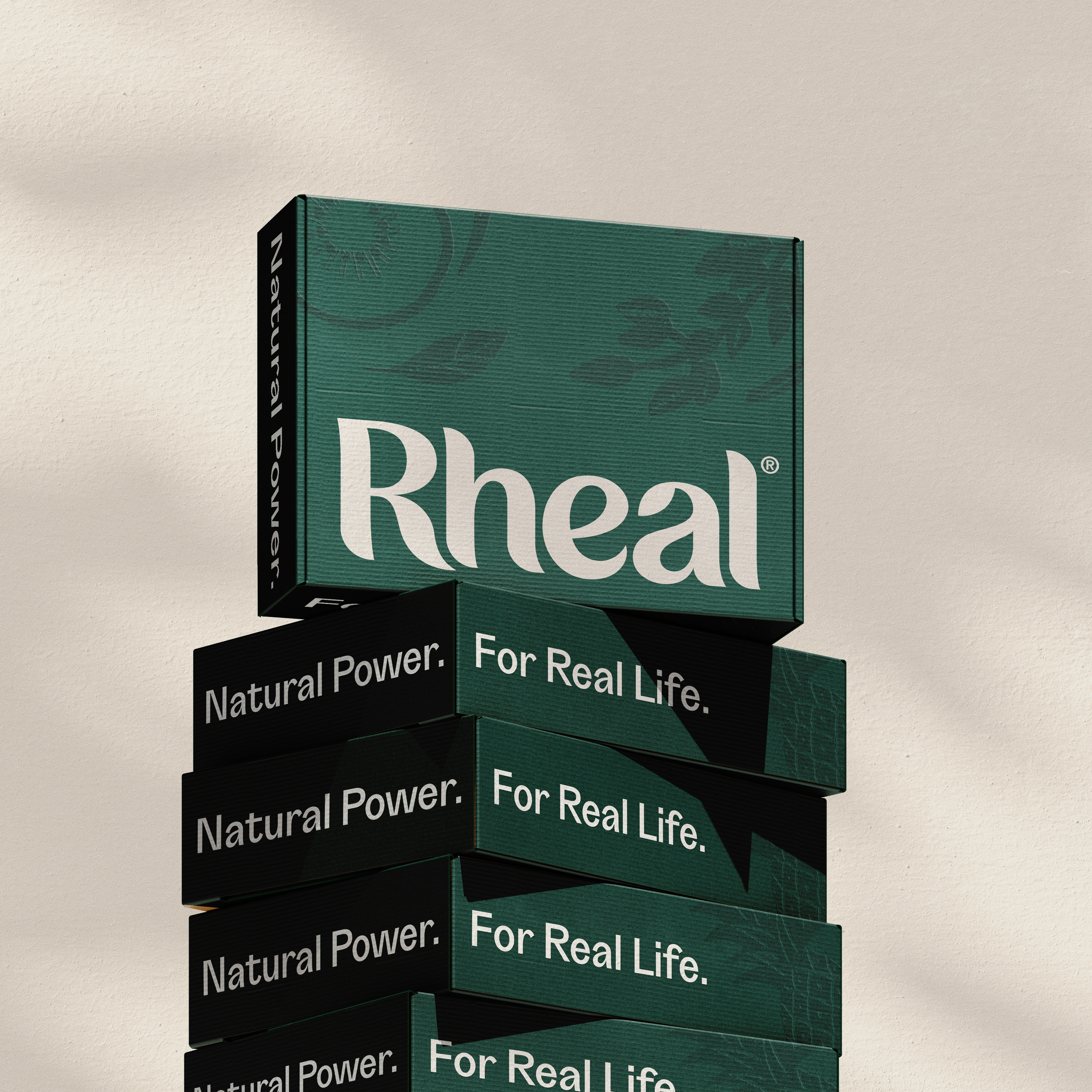
Through extensive research, we identified their audience: Mindful Multitaskers – people juggling busy lives who still want to feel nourished, empowered, and supported. This insight became the foundation for the new positioning: Natural Power. For Real Life. Every element of the brand – from packaging and typography to illustration and photography — was designed to reflect this positioning in an authentic, bold, and unapologetically honest way.
The result is a brand that doesn’t just look refreshed – it feels purposeful, confident, and ready to grow with its audience.
Rheal’s existing brand and packaging lacked confidence and market standout – It wasn’t working hard enough to convey their passion and powerful natural recipes.
Pre-Evolution
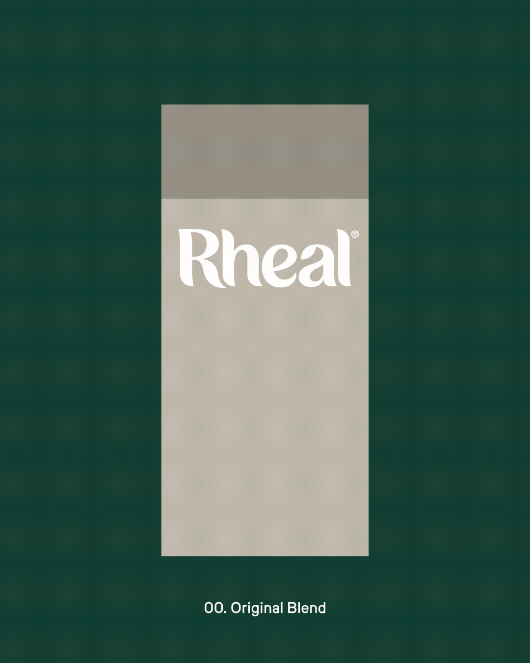
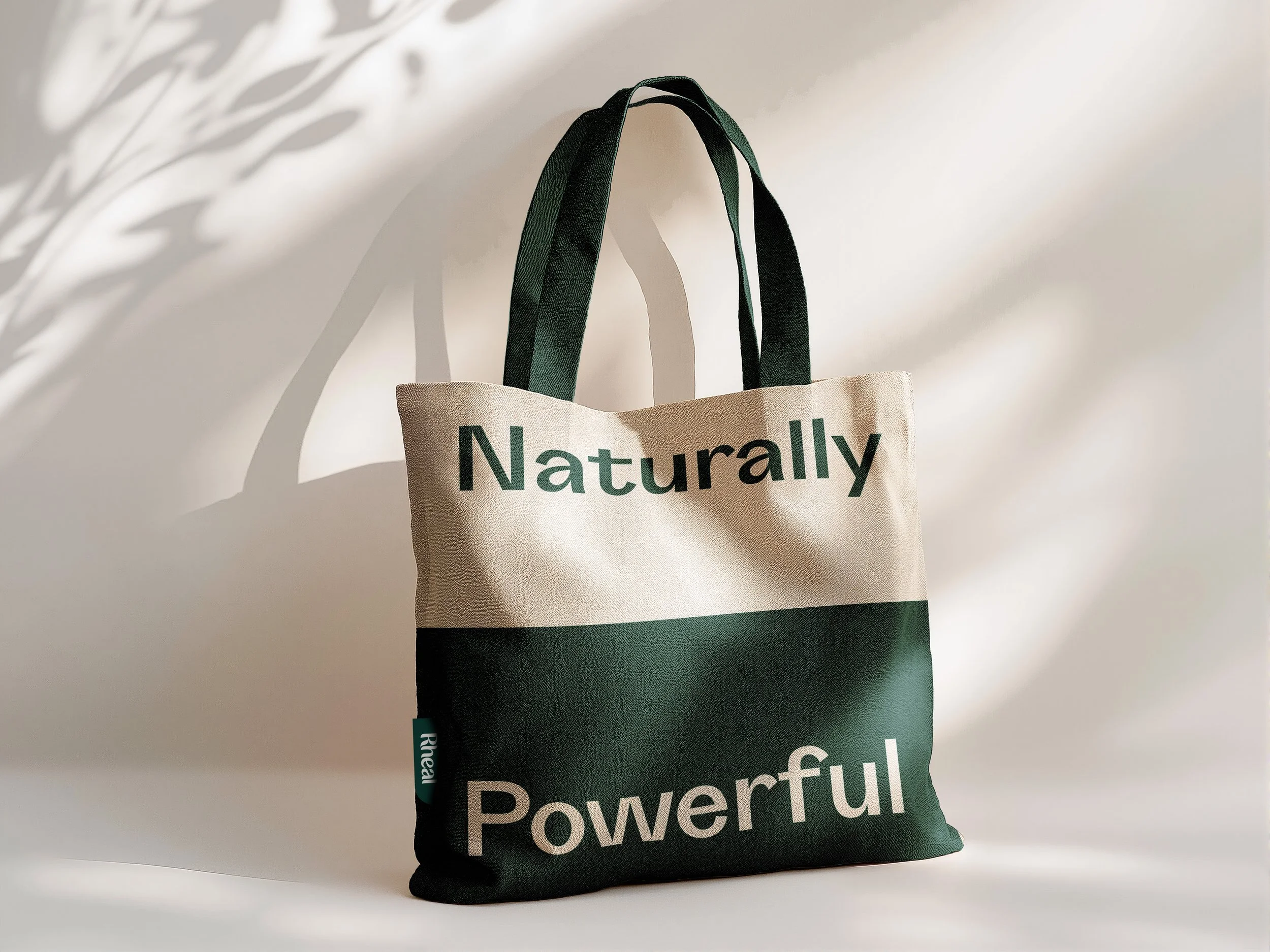
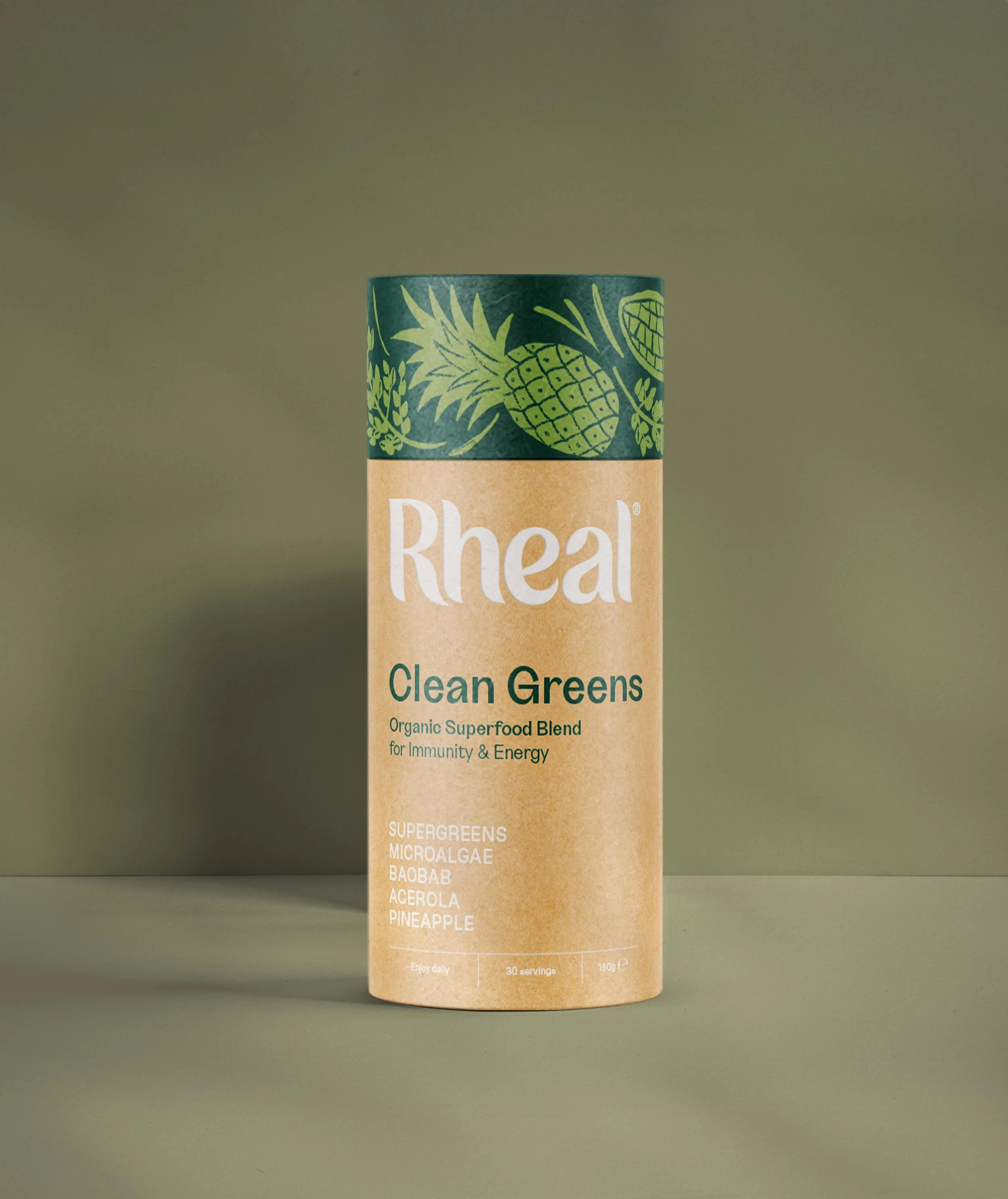
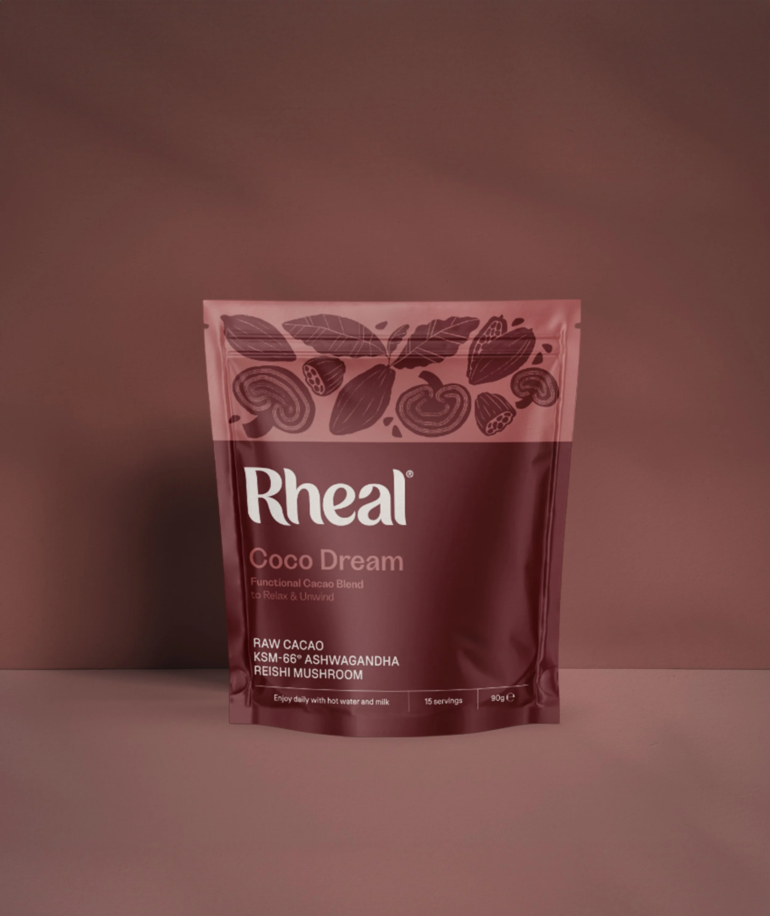
Celebrating natural power
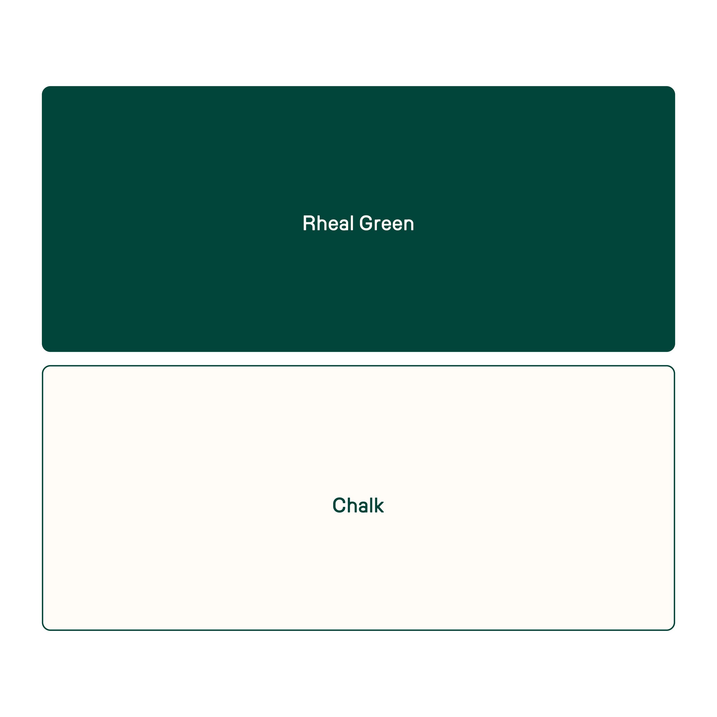
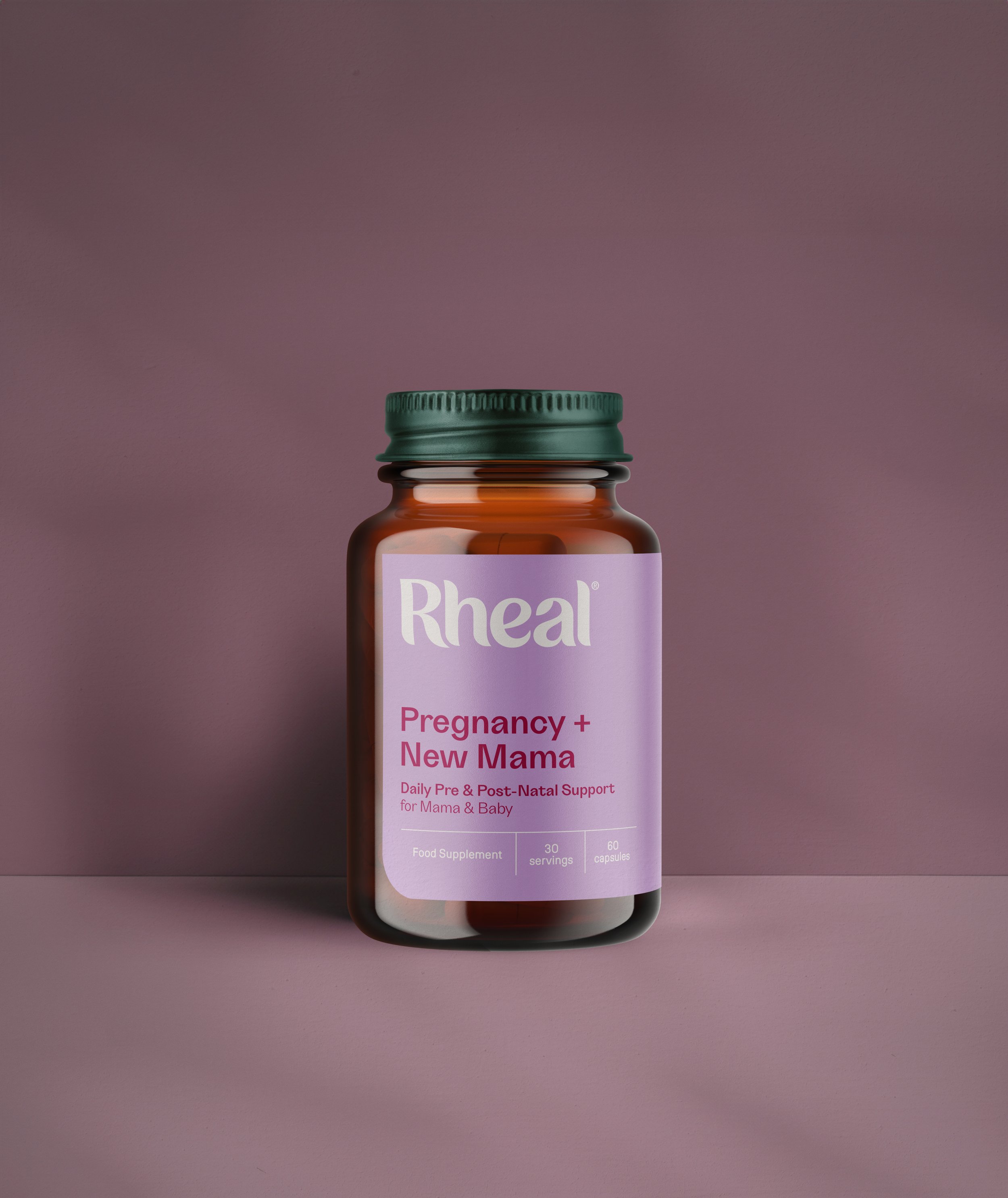
Rooted in Rheal’s heritage, the refreshed colour palette centres on Rheal Green and a soft chalk neutral. A secondary palette of Honest Neutrals, drawn from natural materials and ingredients, brings warmth and depth while complementing the packaging colours.
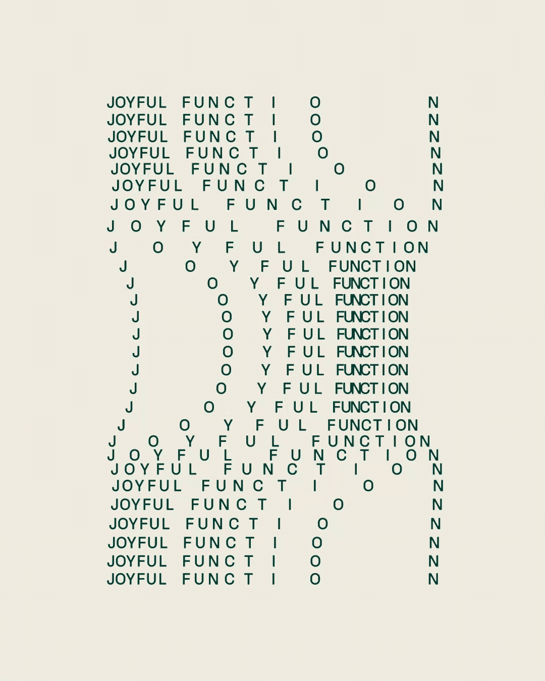
Naturally powerful / Joyfully functional
To reinforce Rheal’s boldly honest new brand, we created a typographic palette built around just two typefaces. Each serves a distinct role inspired by the brand positioning, Natural Power. For Real Life. Grotta (left) reflects Rheal’s natural power, while Lost (right) brings a joyfully functional tone to the system.
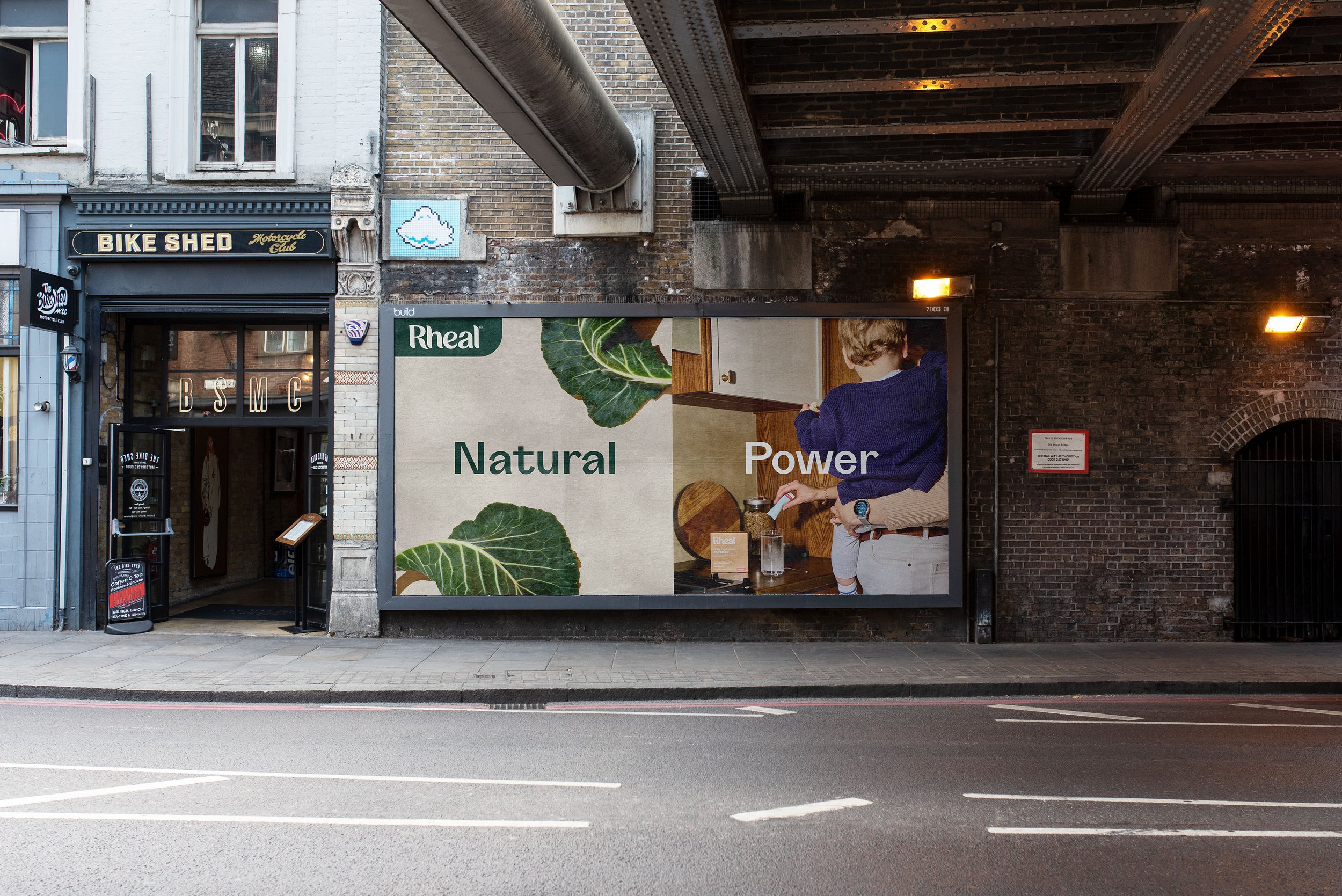
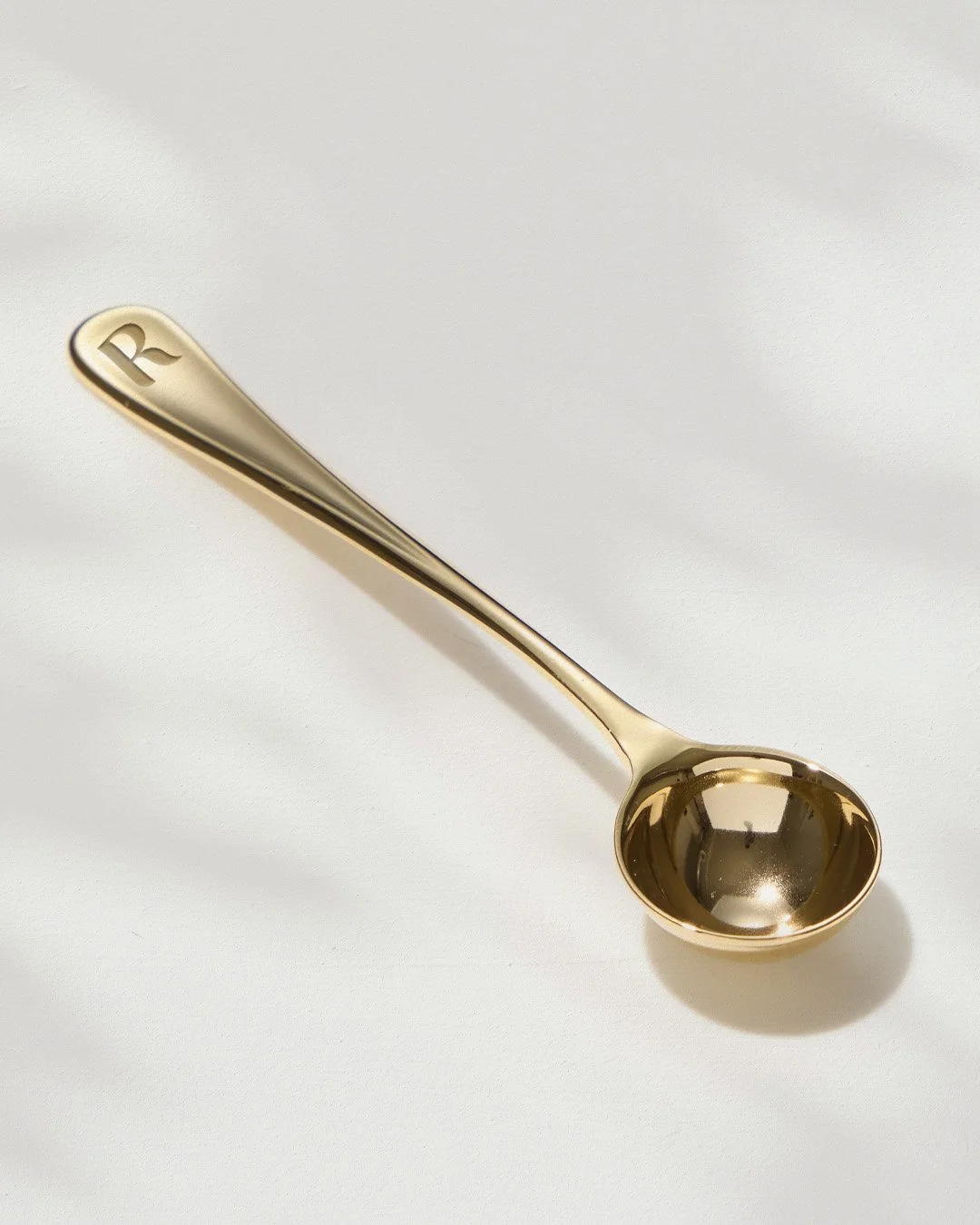
Creating an ownable device
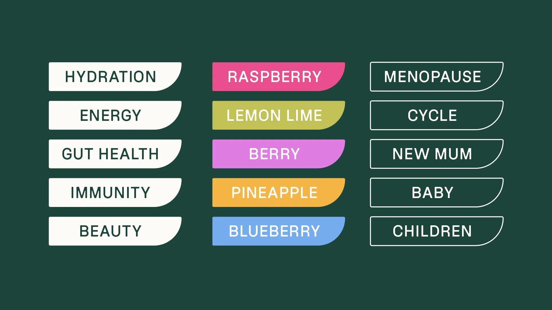
With multiple layers of functional messaging to communicate, Rheal needed an ownable graphic device that could work across touchpoints. The Rheal Capsule delivers flexible messaging in a form that is unmistakably Rheal, crafted to echo the curved edges of the refreshed logo.

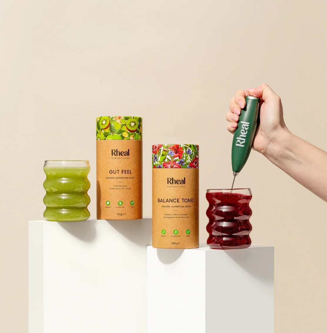
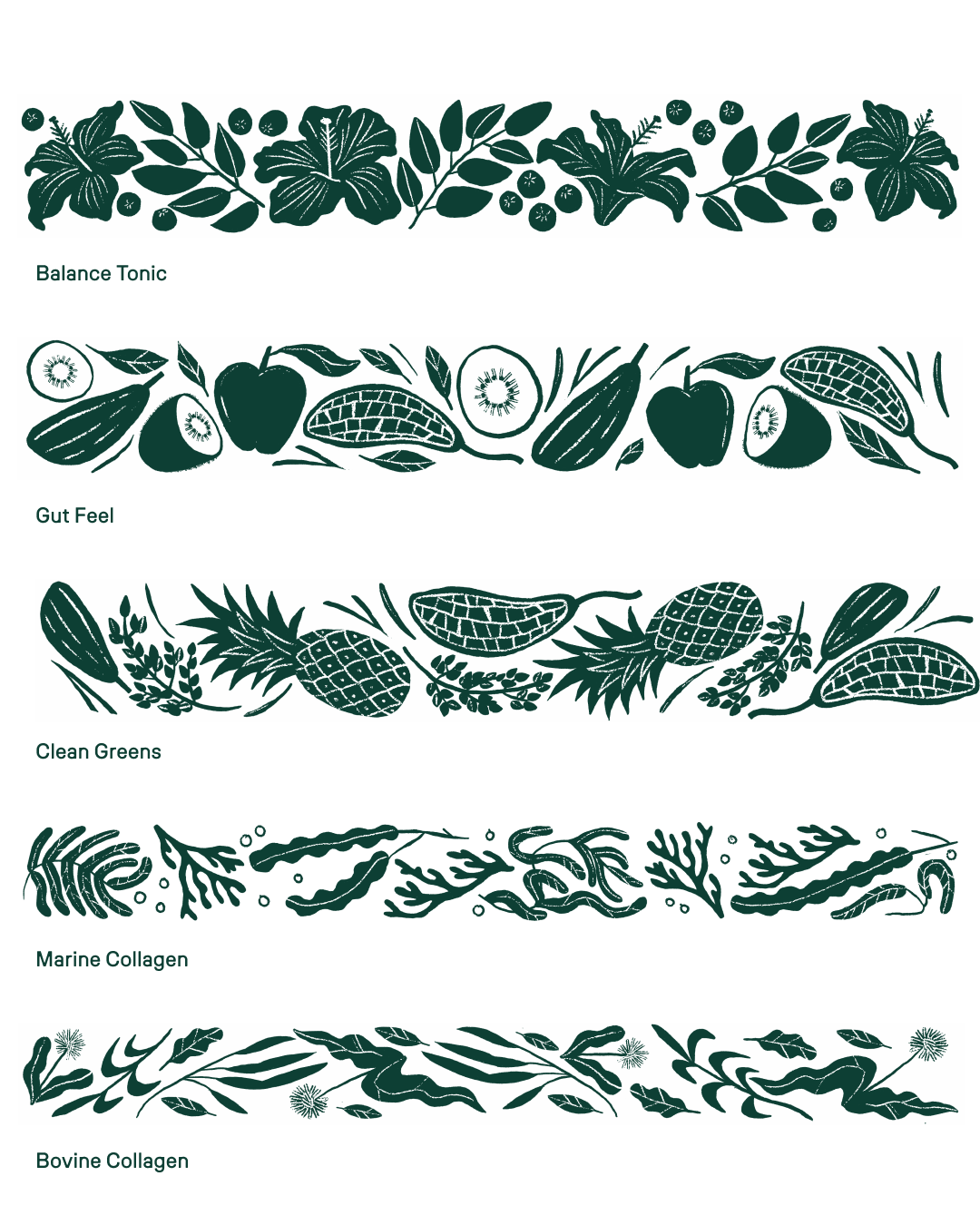
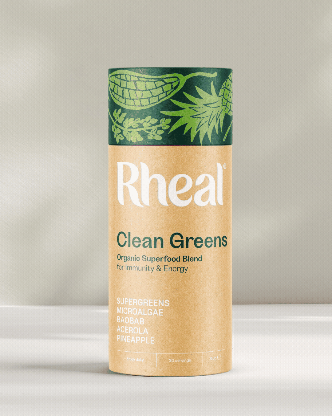
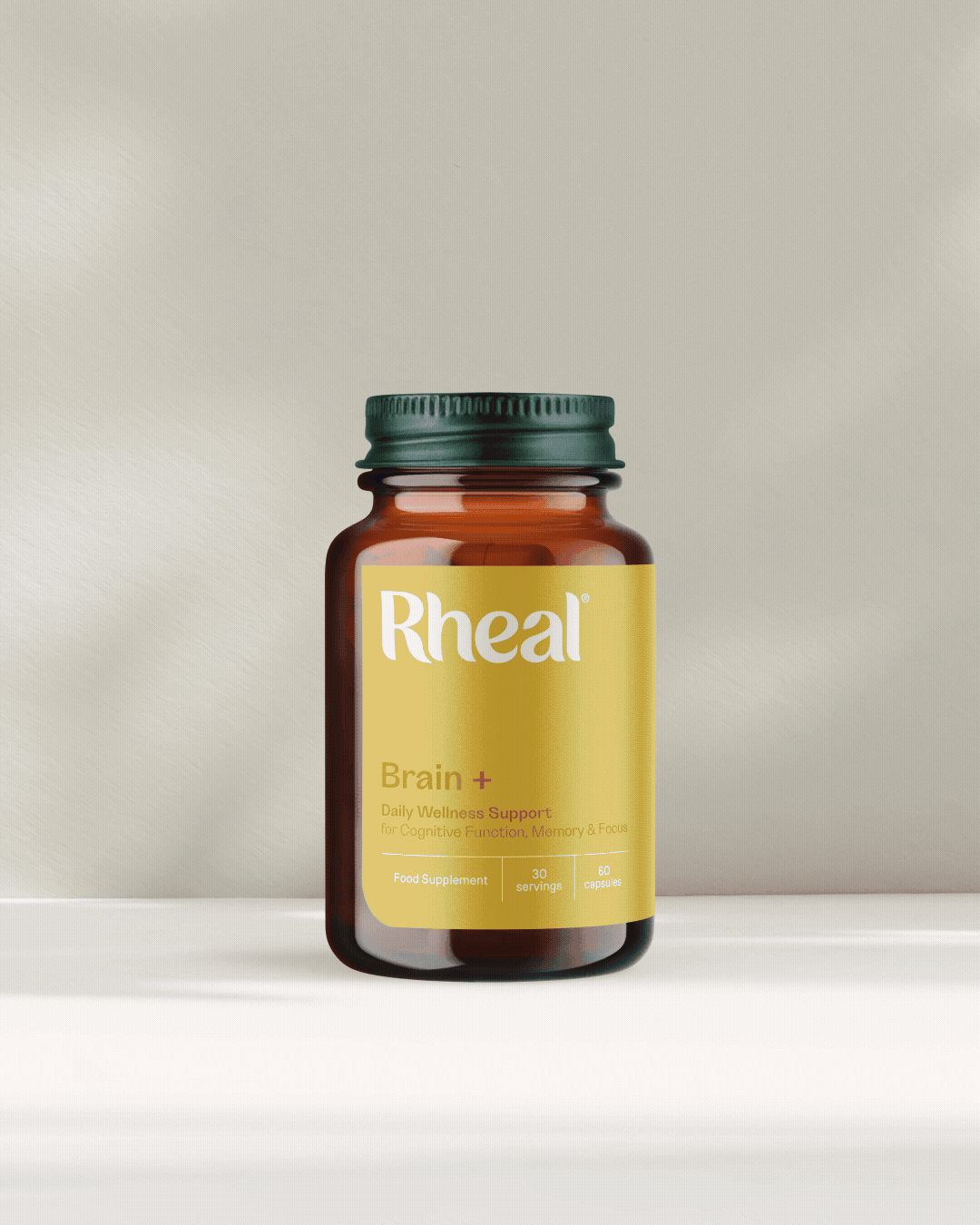
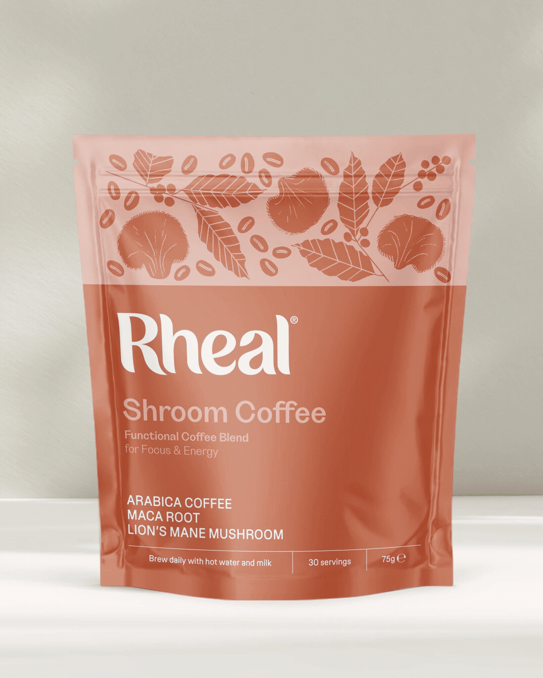
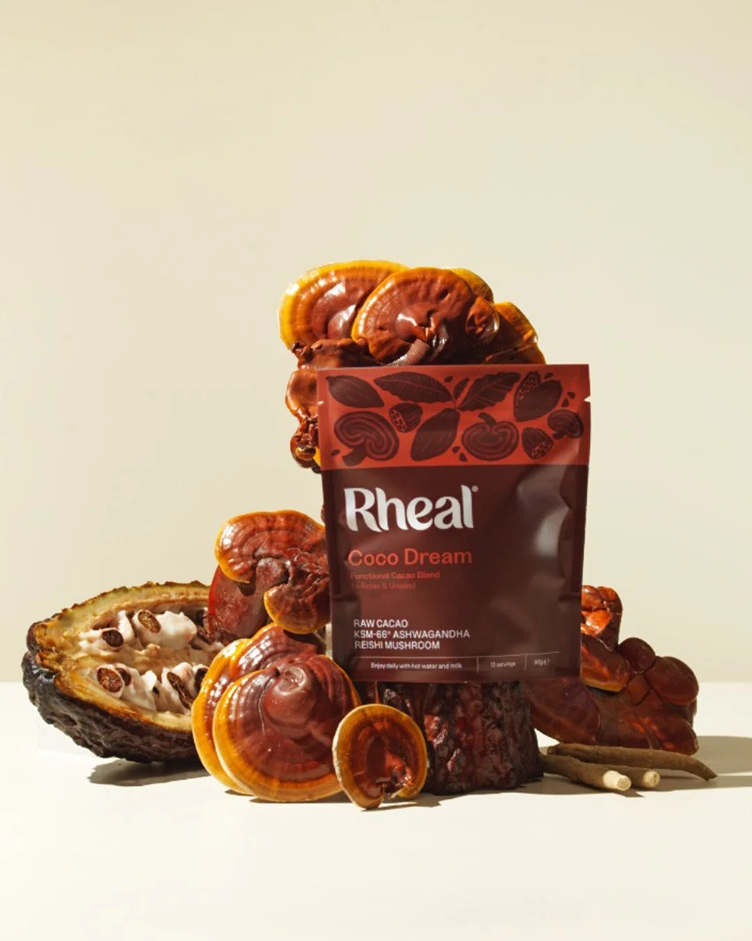
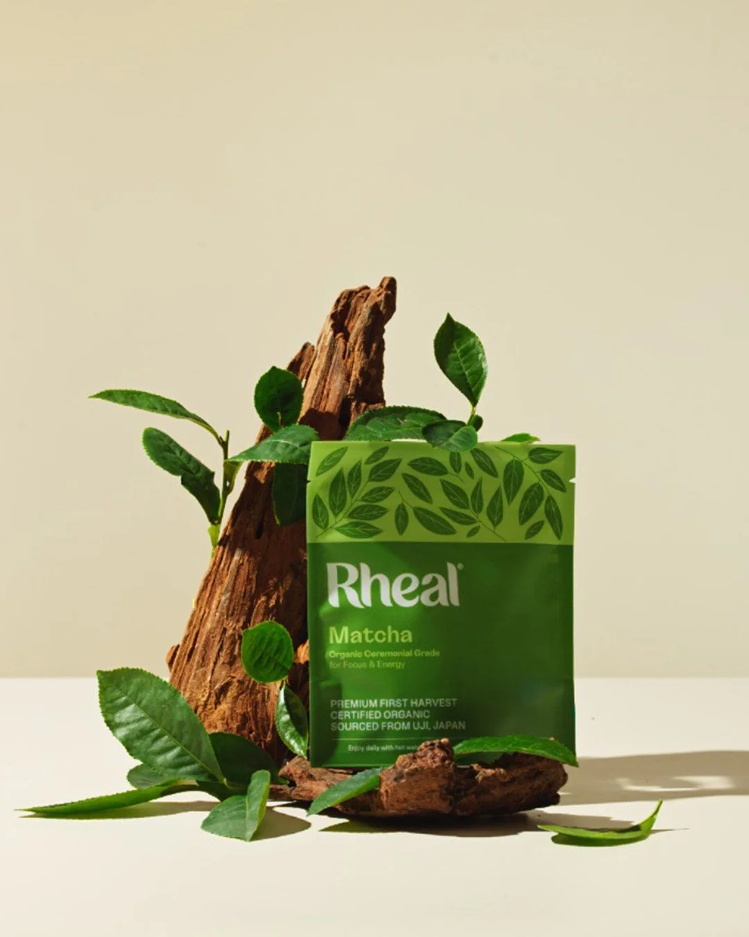
Beautifully Curated Blends
Illustration has long been central to Rheal’s packaging, providing flavour cues and reinforcing natural credentials. The refreshed style celebrates powerful, natural ingredients through a bolder, more honest expression aligned with the brand’s growing confidence.
Illustrated by Alisa Johnson
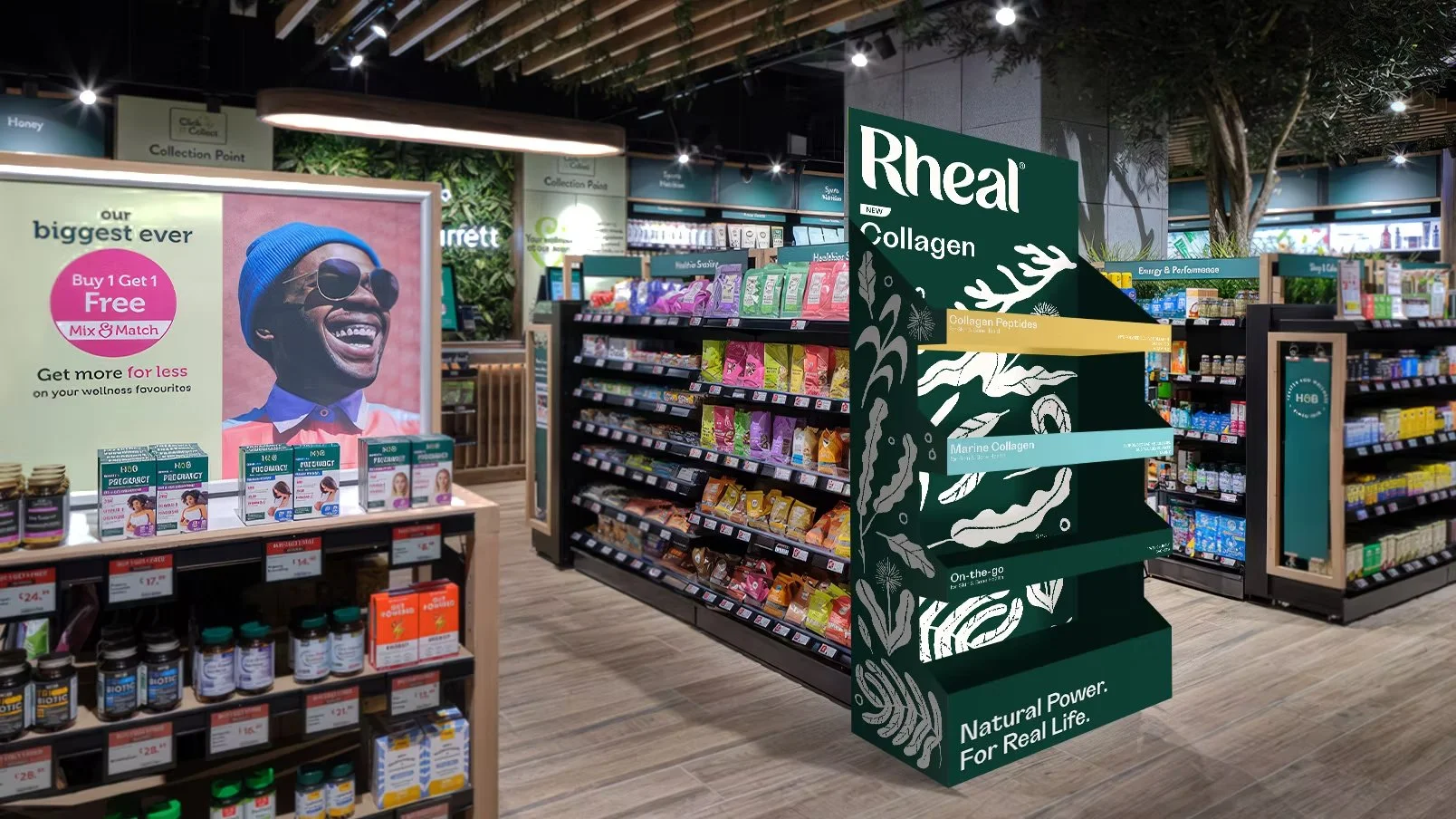
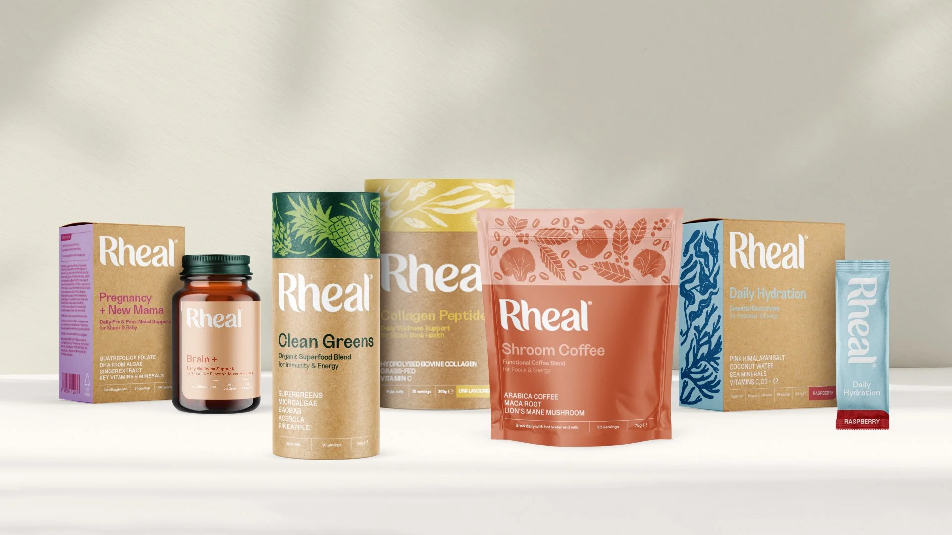
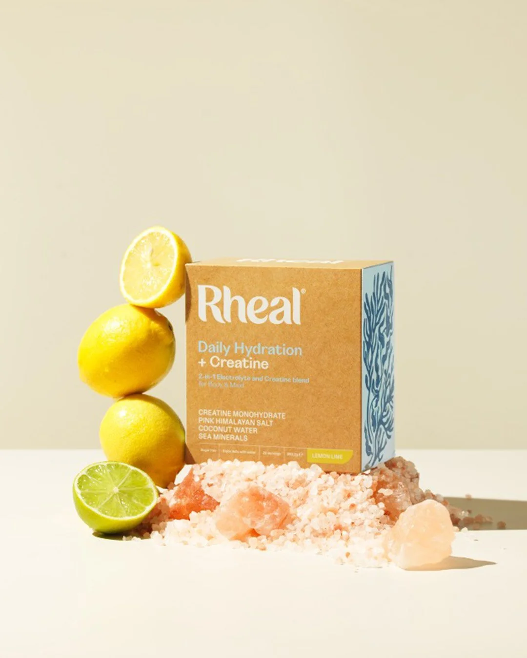
Creating a flexible packaging system for a growing range.
As Rheal continues to grow, we developed an adaptable framework that scales across formats, supports varying levels of messaging, and delivers strong shelf standout while maintaining a cohesive brand presence.
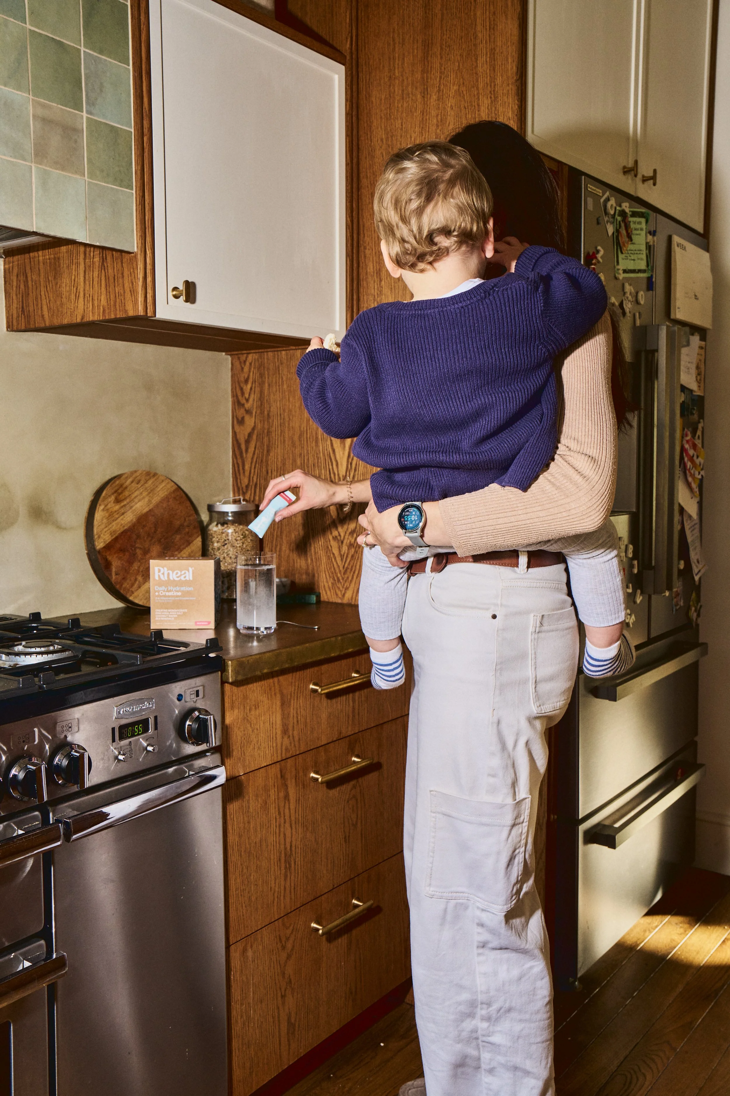
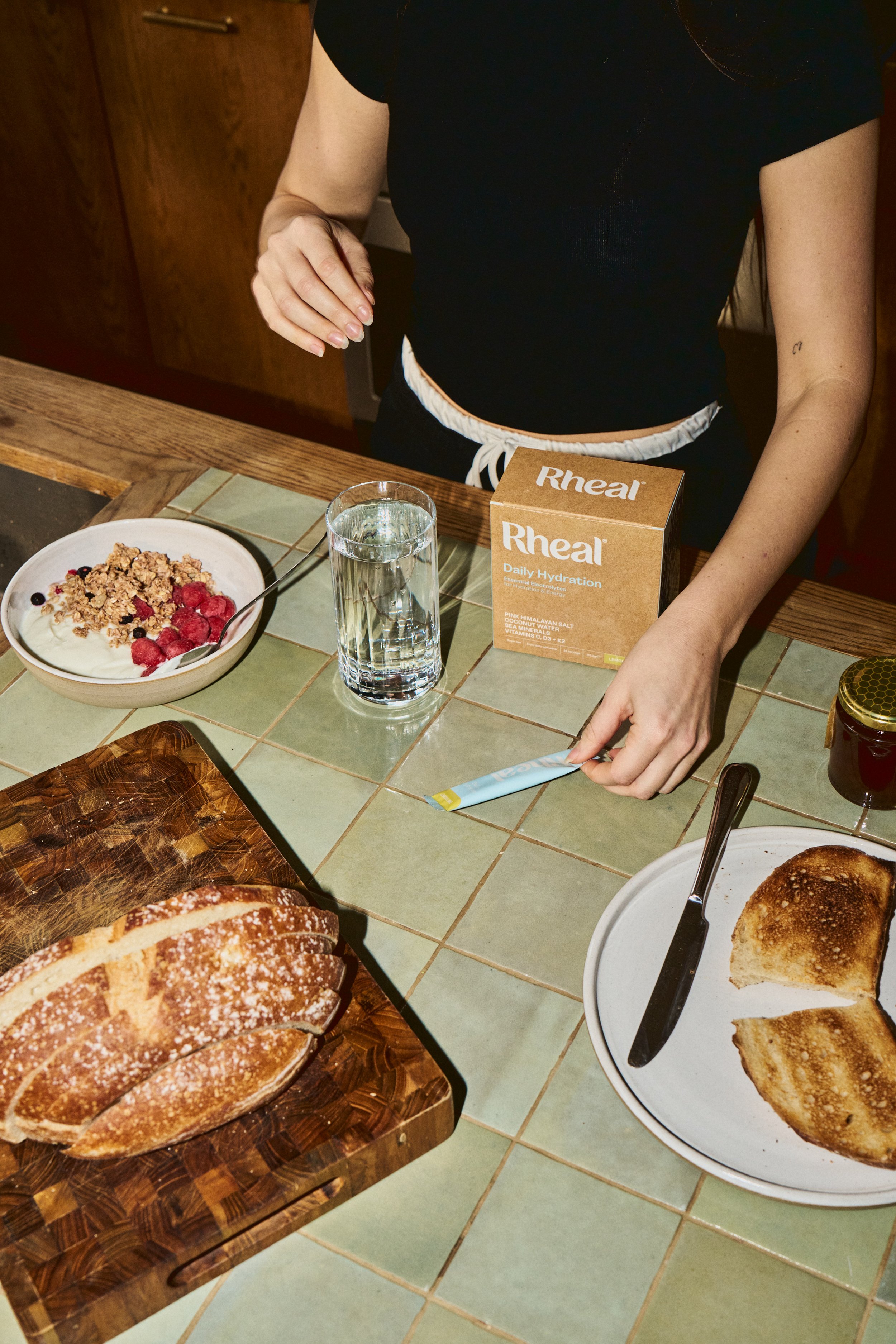
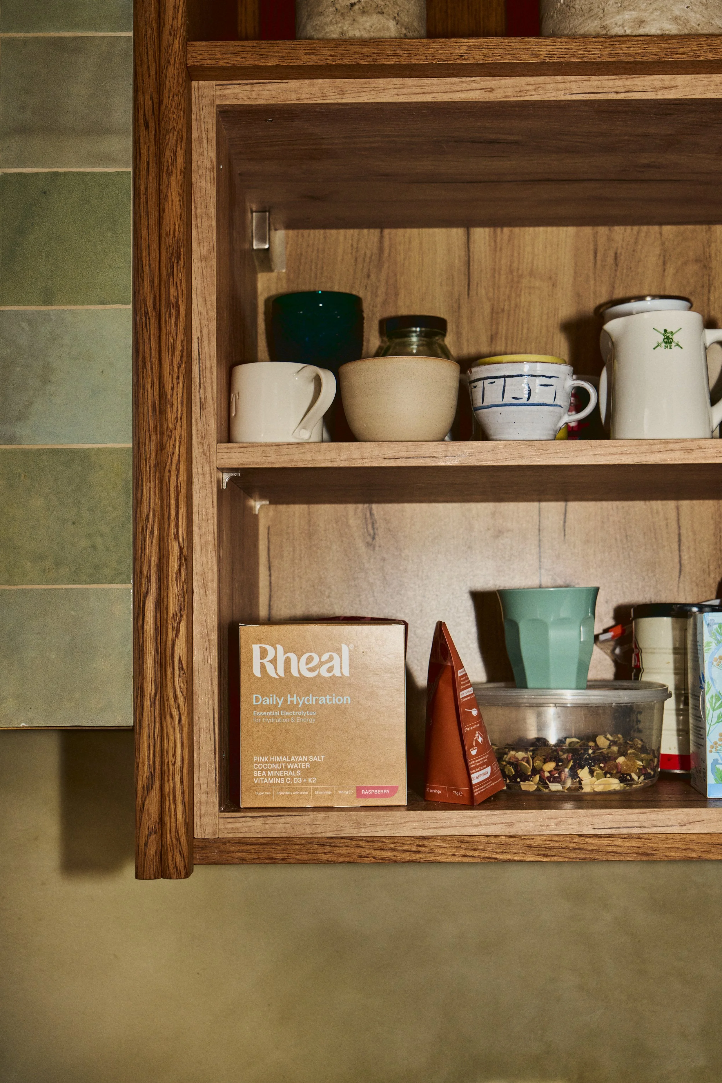
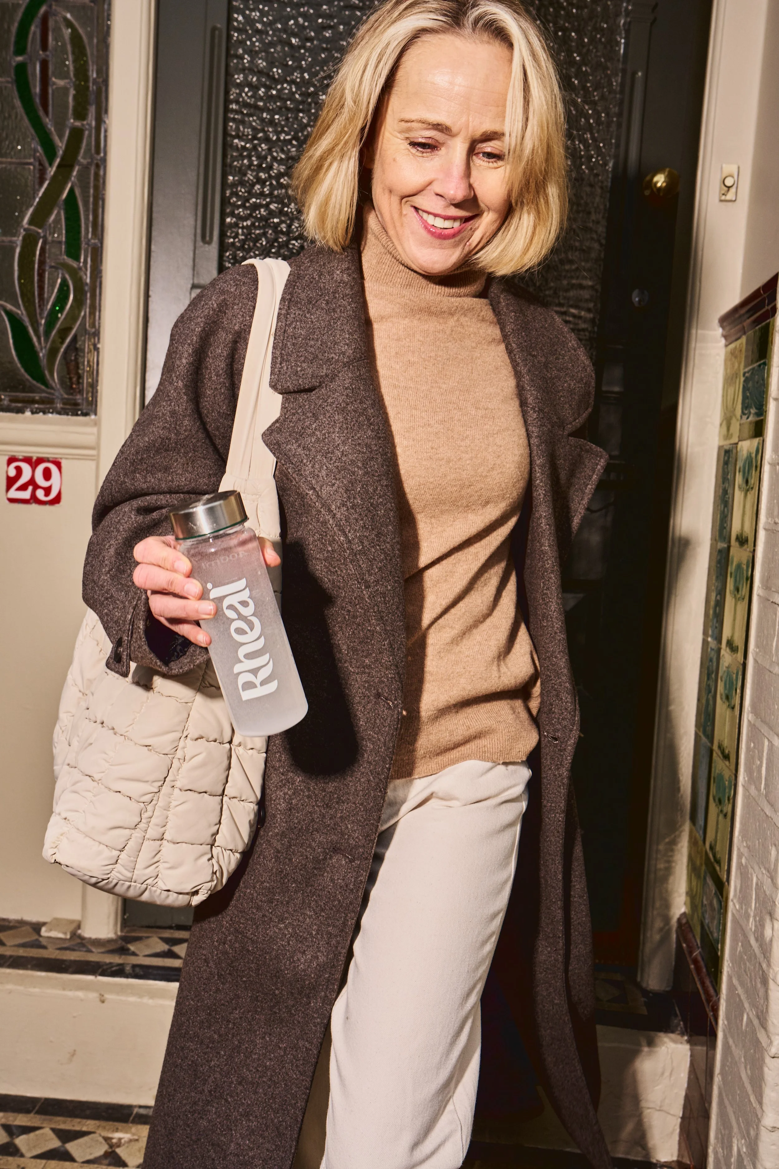
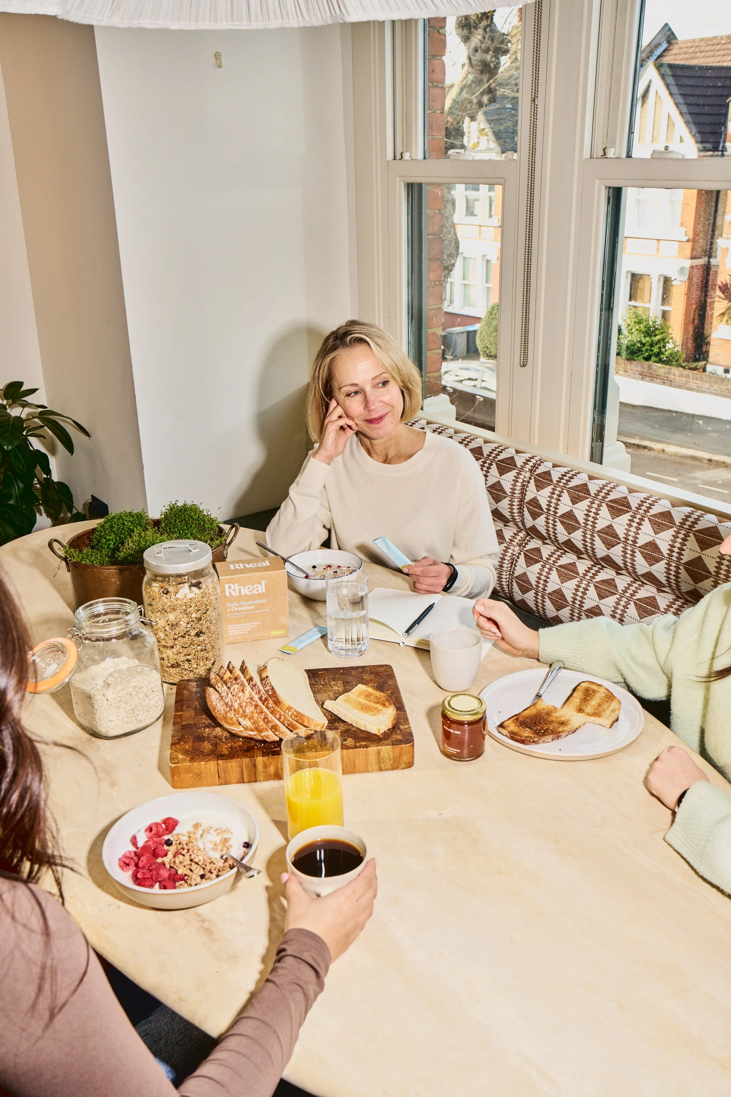
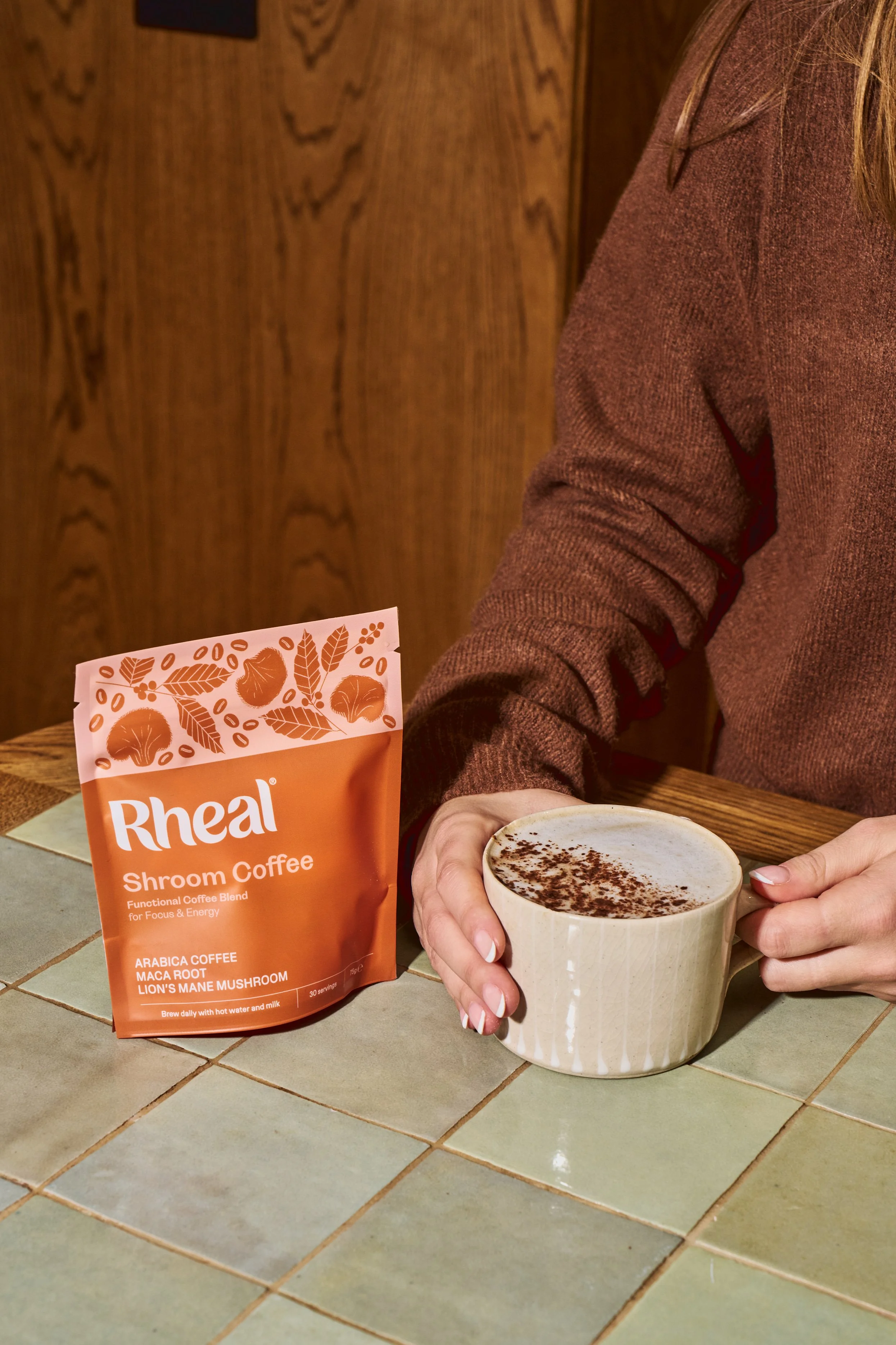
Capturing Rheal Stories
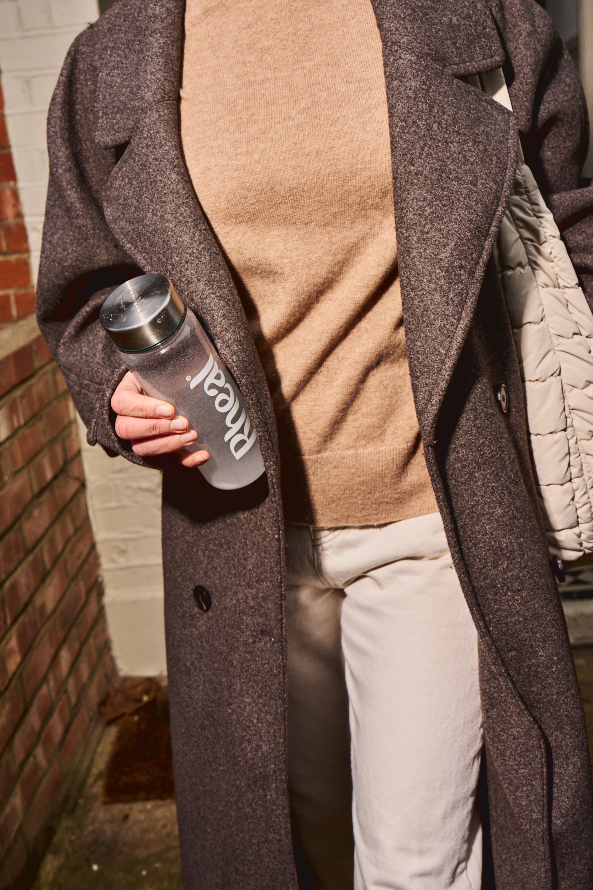
The new photography is authentic and raw, capturing real people and real lives, with Rheal supporting them at every moment – no matter how messy. High-flash lighting and saturated colour emphasise the brand’s warmth and vibrancy.

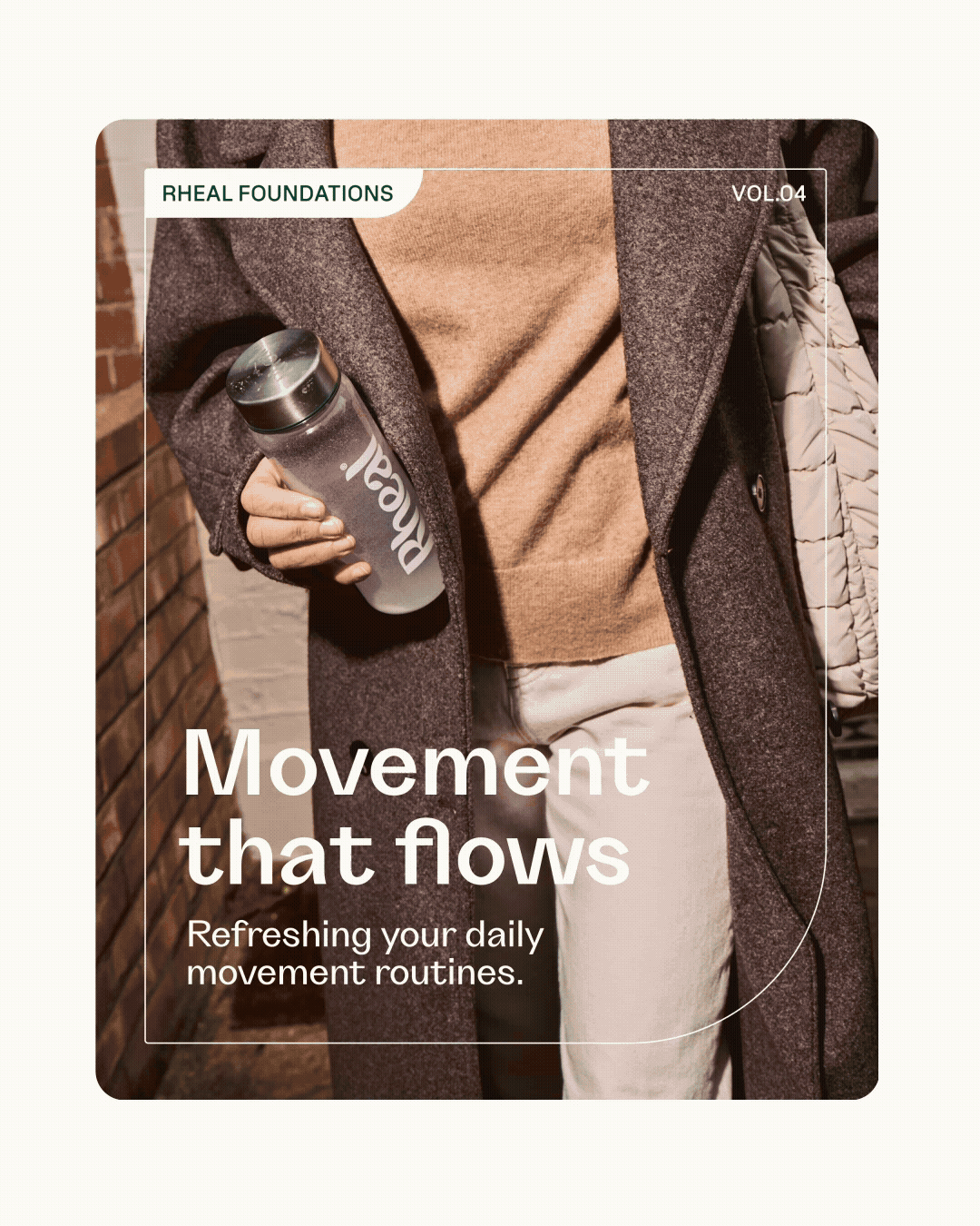
A flexible social system
Experts in natural nutrition, Rheal needed a social system to share their knowledge in a way that felt engaging and on-brand. Our templates deliver functionality and flexibility, while expressing the warmth, confidence, and distinctiveness of Rheal’s tone.
Bringing the Rheal brand to life
〰️
Bringing the Rheal brand to life 〰️
Otherway (2026)